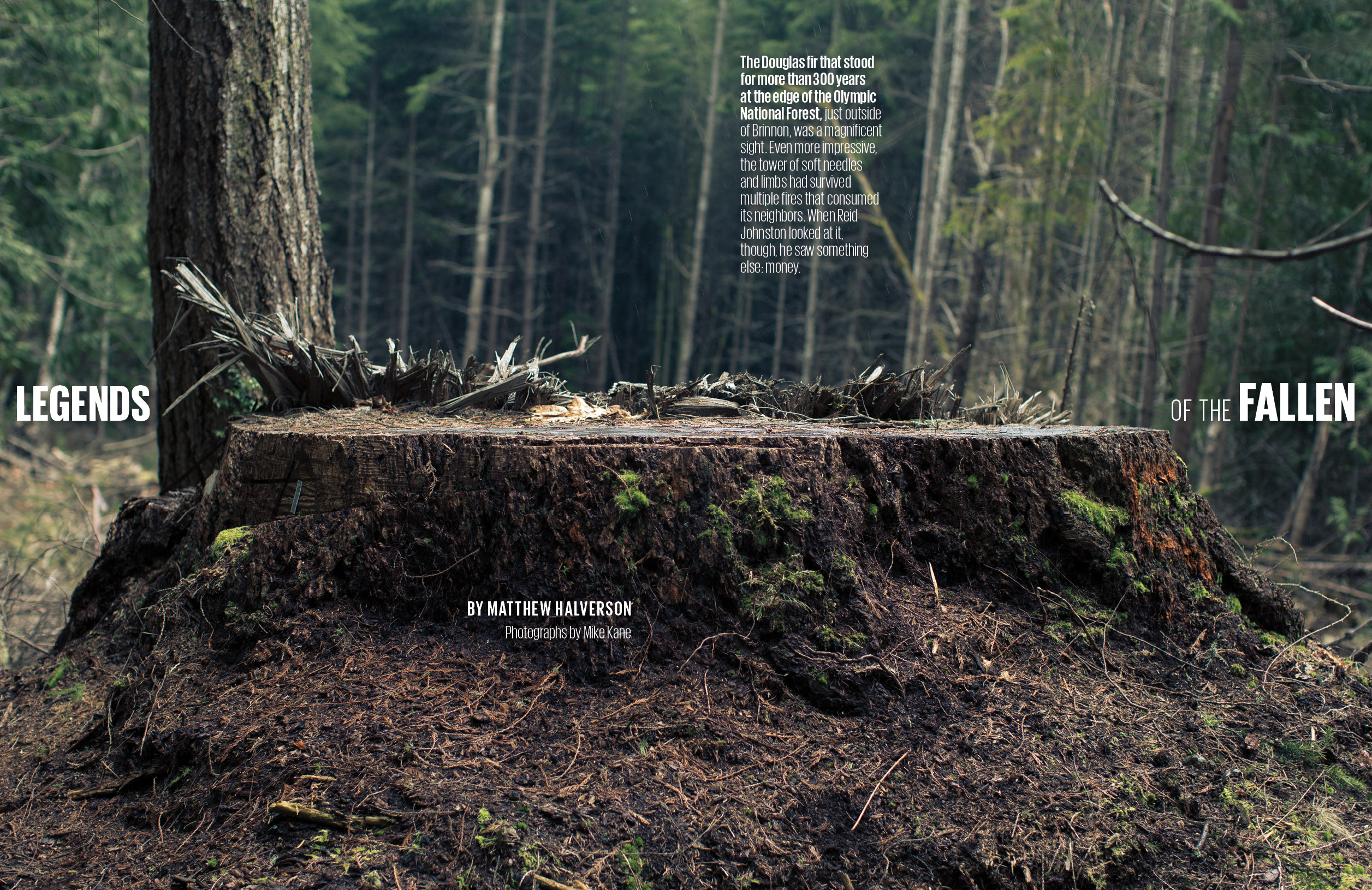
Seattle Met, Giorgio Phase

In 2013, toward the end of my time designing Seattle Met magazine, I introduced Giorgio. Looking back on my work, it seems like I was trying to freshen things up without going through a full redesign. It started from a pure place: I wanted a condensed sans because Colfax, used throughout the magazine, didn’t have one. But I knew I was tempting fate, because I’ve always felt like condensed faces are an easy way out for editorial design, almost like cheating — they’re all too happy to squeeze in and save you. For instance, the “Bad Blood” opener. It’s not really doing anything but it’s nice and big and doesn’t spoil the stunning photograph. That said, Giorgio and Giorgio Sans were designed for a specific magazine and purpose — “bringing runway proportions to the page in contrasting ways” — and I think it’s impressive that they made italics for both typefaces (which was a big selling point for me). So my opinons about using condensed fonts is a critique on designers who reach for them in times of need, as I did. But hey, when the clock is running down on the monthly production cycle, they sure do save a lot of time.