
Per Amore movie posters and score
Contributed by Quentin Schmerber on Sep 1st, 2017. Artwork published in
circa 1976
.
Source: www.filmtv.it License: All Rights Reserved.
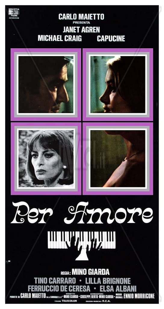
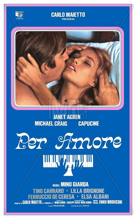
Per Amore (1976) is a totally forgotten Italian movie directed by Mino Giarda and produced by Carlo Maietto, starring Janet Agren, Michael Craig and Capucine. The movie score is by Ennio Morricone and Luis Bacalov. The film title is consistently rendered in Crayonette. The secondary typeface used on the posters appears to be Akzidenz-Grotesk extra a.k.a. Standard Bold Condensed, a pre-digital cut distinguished by a straight-legged ‘R’.
Source: www.flickr.com License: All Rights Reserved.
Source: www.senscritique.com License: All Rights Reserved.

Cover of the original vinyl record with the film score by Morricone & Luis Bacalov (RCA)

Source: www.discogs.com License: All Rights Reserved.
Backcover of the original vinyl record, featuring a reproduction of one of the posters

Source: www.discogs.com License: All Rights Reserved.
Cover of the 2007 CD reissue.

Source: www.discogs.com License: All Rights Reserved.
Extract from the insert in the reissue.


")


3 Comments on “Per Amore movie posters and score”
Why are Arial and Verdana listed among the fonts for this? They weren’t even designed until 20 years later (circa 1996).
Craig, sorry for the confusion. You are correct, Arial and Verdana weren’t around in 1976. This date refers to the film posters and the original album with the film score.
At the very end of the post, Quentin includes images from the 2007 CD reissue, showing that the film logo in Crayonette was retained. The secondary faces were replaced, though: The cover features a still photograph from one of the posters, ran through a filter, paired with Verdana caps. The insert includes a facsimile of the original album cover featuring the white keyboard, with the type reset in Arial.
Crayonette’s capitals again sit on the baseline. Here, the designer noticed that they tower too high over the lowercase this way. Instead of letting them descend, they were scaled down to circa 60% of their size.
This illustration using Crayonette DJR shows, from top to bottom: ➊ default, ➋ raised caps (as this typeface often was presented in phototype), ➌ caps scaled to 60% (+ the tight-not-touching spacing that was so typical of the 1970s).