
ATypI 2017 Montréal

I’m usually not a big fan of ATypI’s graphic identity, but for this year’s conference in Montréal, Julien Hébert is doing an incredible job using a bunch of fresh and amazing typefaces!

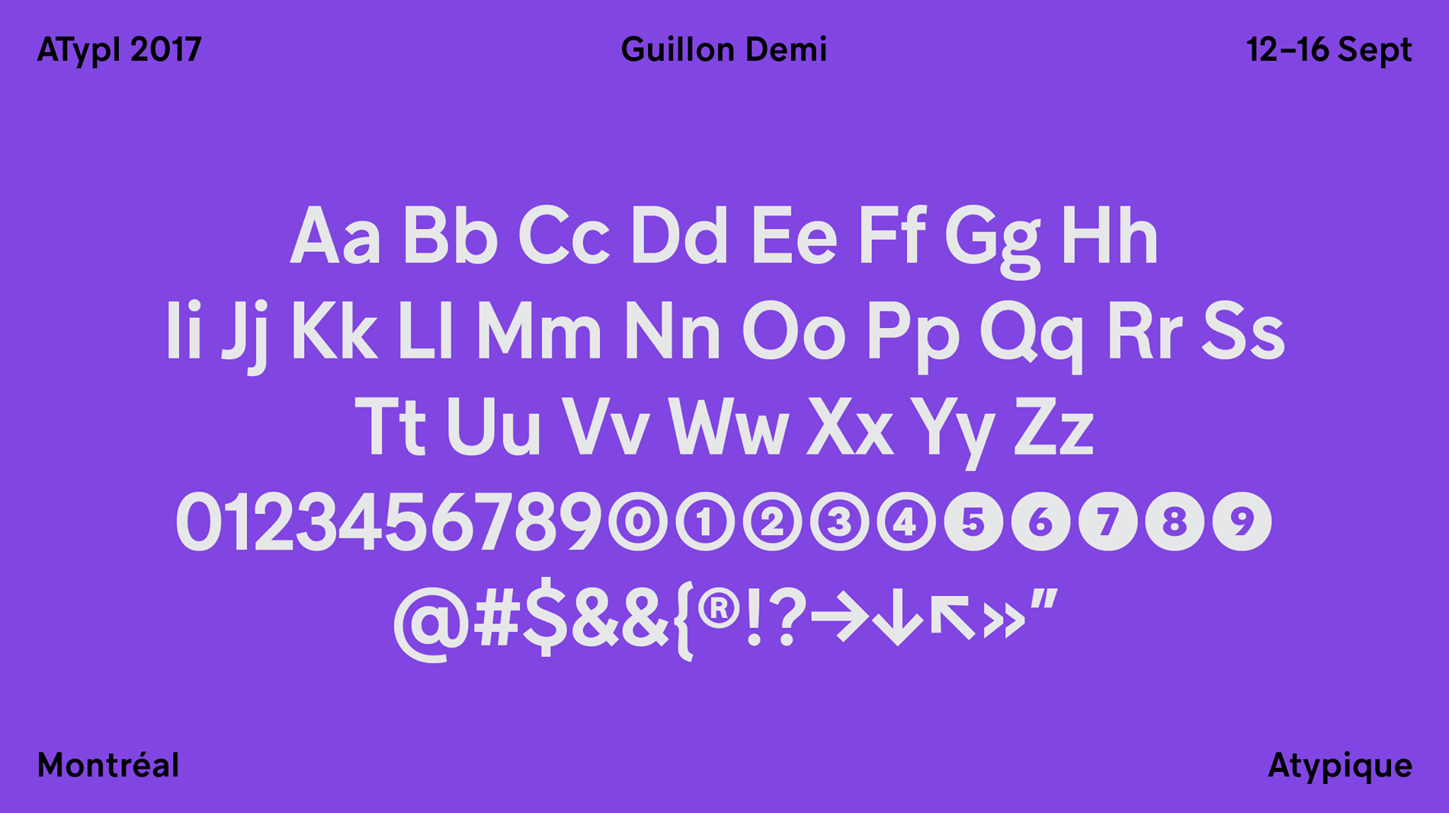
Julien Hébert says he chose Guillon as the principal typeface for this year’s conference because it was developed in Montréal by the very talented Feed Studio and Coppers and Brasses. As we celebrate the 50th anniversary of Montréal’s Expo 67, Guillon pays homage to the mid-century modernist grotesque, and is perfectly suited to the very heteroclite applications to come.

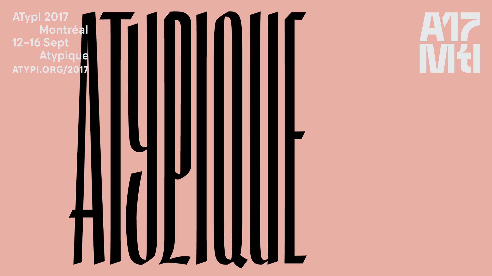
Julien Hébert: “The A17Mtl mark was created from scratch and meant to reflect this year’s theme: Atypique (atypical in French). I had fun with ink traps, making the mark look good at all sizes, as well as geometry, creating very satisfying alignments and fitting the mark in a perfect square.”

Joe182 is “a script face based on the authentic traces left by a thick chisel-tip marker”.
![Here I should thanks Florian Hardwig who is your man when you need some ID help:
“The condensed broken script looks like Gandur Neue, with the ‘e’ taken from the small caps.”
[Correction: It’s simply Gandur Alte in all caps, see the comments.]](https://fiu-original.b-cdn.net/fontsinuse.com/use-images/55/55993/55993.jpeg?filename=DEofQKyXsAA6nNq.jpg)
Here I should thanks Florian Hardwig who is your man when you need some ID help:
“The condensed broken script looks like Gandur Neue, with the ‘e’ taken from the small caps.”
[Correction: It’s simply Gandur Alte in all caps, see the comments.]
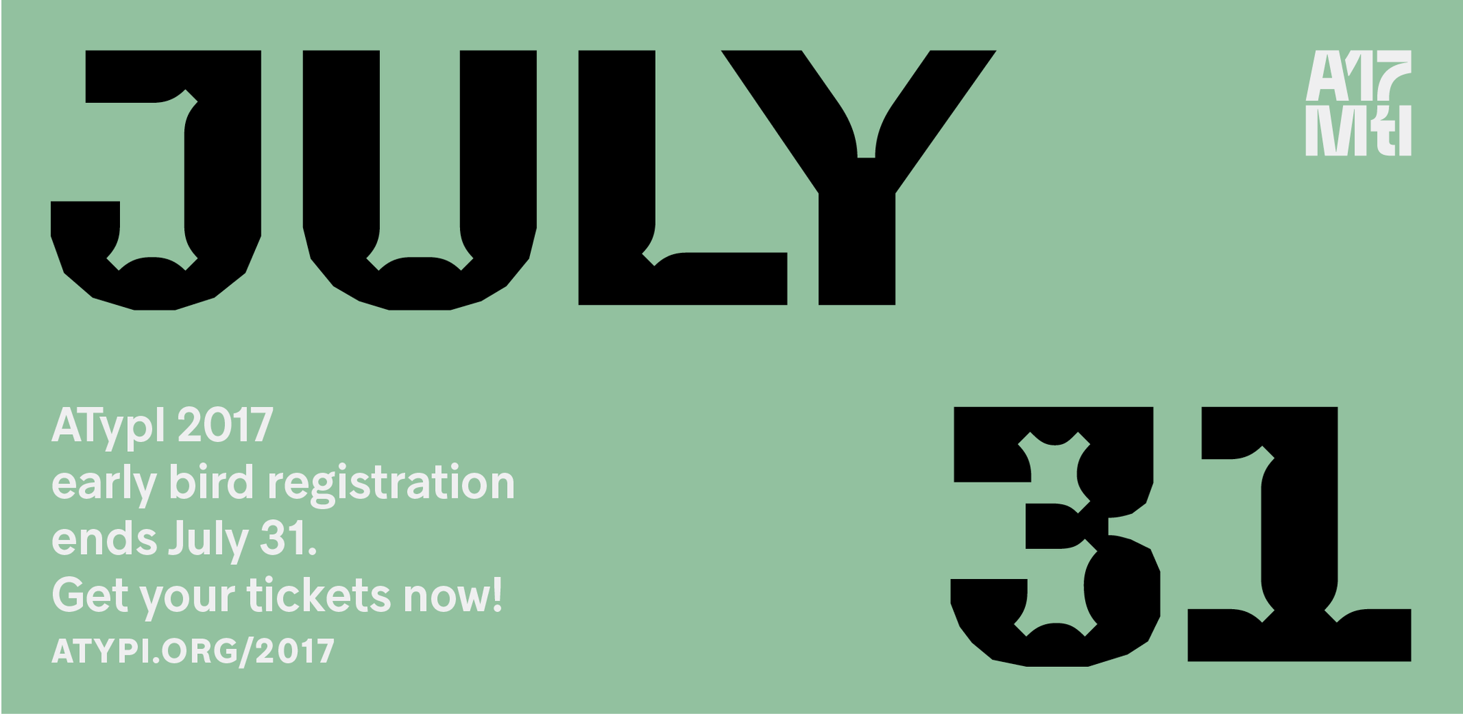
The call for early bird registration is enforced by the use of Minotaur Beef.

Triade is another local typeface, by Montréal-based foundry Coppers and Brasses. See its peculiar Backslant style in action here.

Rozza: “On the one hand prickly and dangerous, and on the other — pulsating beauty and passion.”


“Frauen Roman and Script share a common weight, x-height, and nib angle, and when used together behave as if the same unabashedly German calligrapher penned them both in the same sitting.” — Sharp Type

Lettering done by Julien Hébert.

According to its designers, “Pareto is not even halfway finished with its time travel from Italo Western to Computed Type!”
More lettering by Julien Hébert.

The ring bound program cover feature one more lettering by Julien
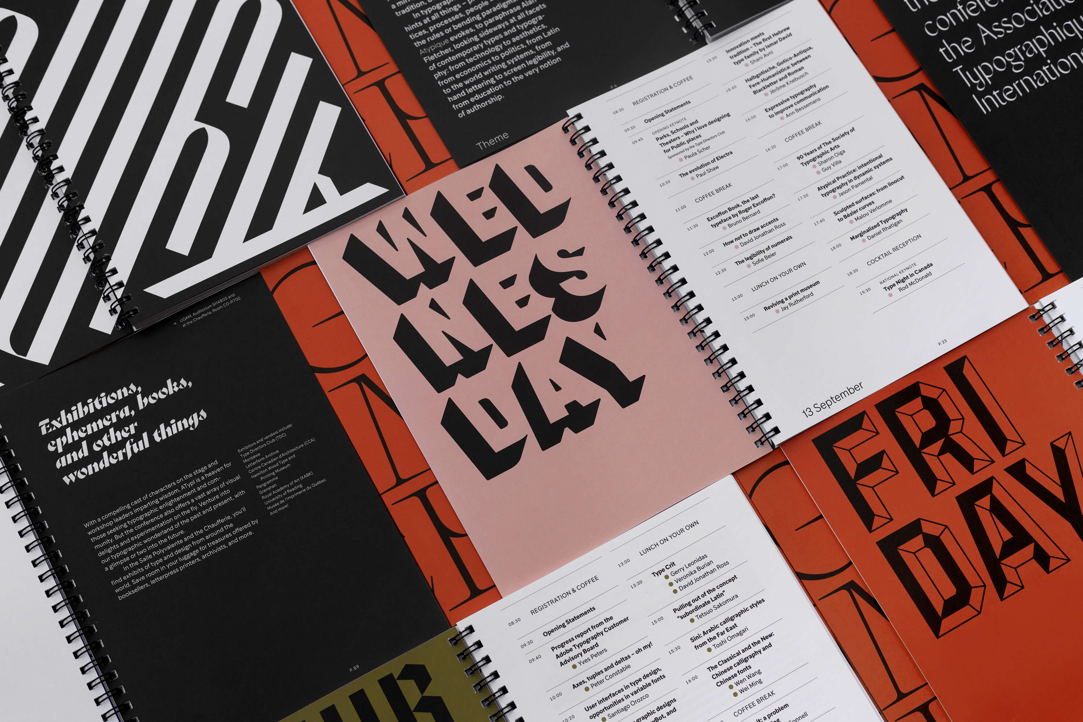
Some spreads from the program, displaying typefaces already featured above and new additions by The Pyte Foundry: Umbra, Octango and Symptom (not visible here).

The Mini Schedule and the whole signage on the actual location were set in various styles of Sharp Grotesk.

Two great type scholars (Luc Devroye left, Stephen Coles right) in front of some of the posters Julien designed with its own letterings, at ATypI 2017 closing party.


")


")


")


3 Comments on “ATypI 2017 Montréal”
Big ups for using the original work of living type designers!
Honoured to be in this list! Just a correction: this is Gandur Alte, not Gandur New :) Cheers
Ah, of course! Thanks, Daniel. I mistook the letters for lowercase ones. Fixed.