
Faber Poetry titles
Contributed by Chris Purcell on Aug 9th, 2017. Artwork published in
.

License: All Rights Reserved.
From Design Week, July 2001:
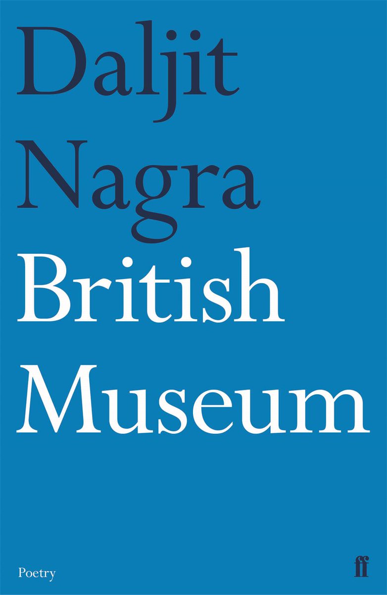
Pentagram partner Justus Oehler has redesigned the entire poetry book series for Faber & Faber. Inspired by some original covers created by post-war graphic designer Berthold Wolpe, the new look emphasises the use of large typography and bold colour combinations. The colours are used to express the feeling and mood of each book, says Oehler. ‘The use of typography only on the covers, rather than images, makes the volumes feel more honest and should appeal to real bibliophiles,’ he adds.
See Faber & Faber’s current Poetry collection on their website.

License: All Rights Reserved.
License: All Rights Reserved.

License: All Rights Reserved.

Faber Books showcases a selection of covers from the Poetry series on their Flickr photostream.


")

")


")


9 Comments on “Faber Poetry titles”
In c. 2009, Tony Davis was commissioned “to create designs which could both exist as designs for retail but also complement the Faber brand and books taking it into new areas of business.” Among the products that reference the Poetry series were porcelain mugs, bookbags, and a pack of playing cards, further iconizing the cover designs featuring Perpetua.
Please could you tell me what font Faber used when printing the poetry of Seamus Heaney – and what point size. I’m asking about the text of the poems and their titles – not about the covers. I’ve been unable to find out online – so I’d be very grateful if you could oblige. Best wishes – Paul Browne
Hello Paul, do you have an image showing a page set in the typefaces in question, or could you point us to one?
Hello
What font (typeface) is used inside of this range of books? Thanks
Hello A, do you have an image showing an interior page from this series, or could you point us to one? I don’t have any of these books at hand.
Sabon
Hmmm…I received two more Faber Poetry volumes in the mail today. One is set in Sabon, like the other Faber titles I have, but the other is set in Minion!
Thank you very much, Chris!