
“London’s Fastest” poster campaign by Nike
Contributed by Luke Freeman on Aug 1st, 2017. Artwork published in
July 2017
.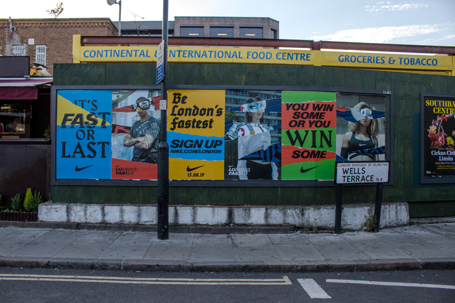
Photo: Luke Freeman. License: All Rights Reserved.
The posters campaign advertising “The Fastest Night” that will take place in London on 13 August was designed in-house at Nike.
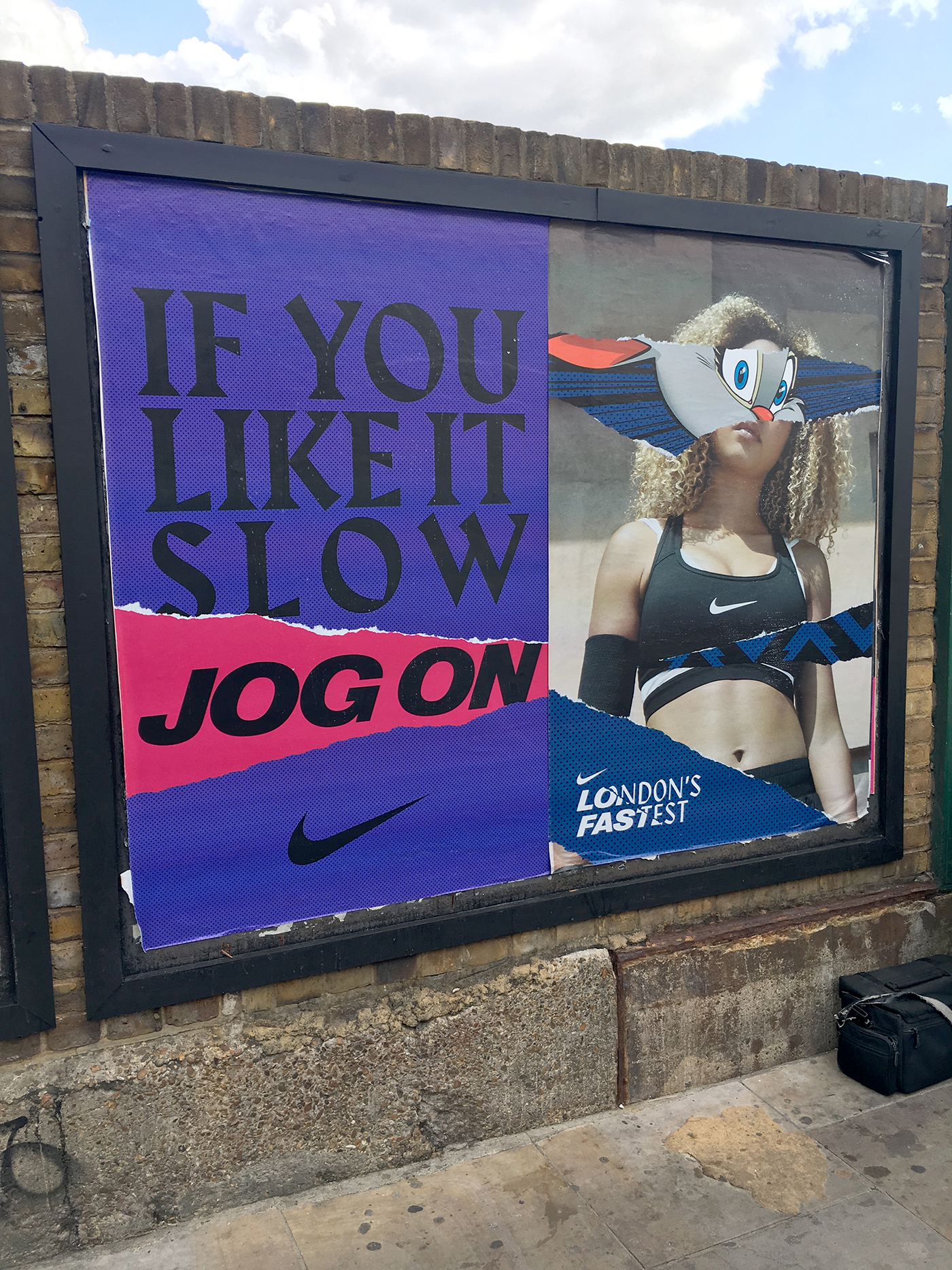
The “London’s Fastest” logo combines sliced caps from Nimbus Sans D Diagonal and Klang. Harbour is used for the slogans (“It’s fast or last”, “You win some or you win some”, “If you like it slow jog on”), also in all-caps. The typeface palette is perfected by a slanted Tannenberg halbfett (bold) — distinguished from the fett by the descending ‘F’ — which has been additionally fattened by stroking.
Gareth Hague. License: All Rights Reserved.
Stack and justify or die

Photo: Luke Freeman. License: All Rights Reserved.

Photo: Luke Freeman. License: All Rights Reserved.

Photo: Luke Freeman. License: All Rights Reserved.
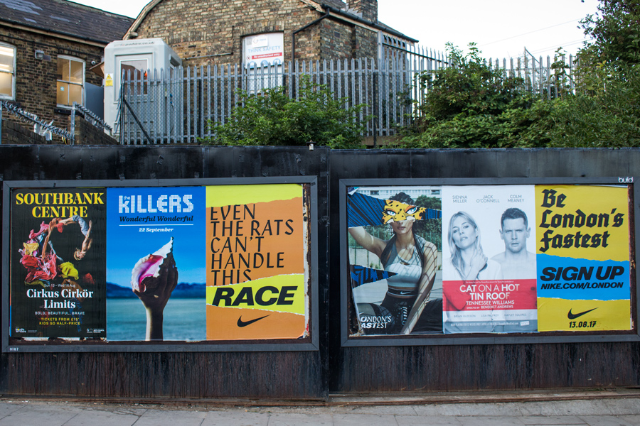
Photo: Luke Freeman. License: All Rights Reserved.
“Even the rats can’t handle this race” — Klang in all-caps

Photo: Luke Freeman. License: All Rights Reserved.

Photo: Luke Freeman. License: All Rights Reserved.
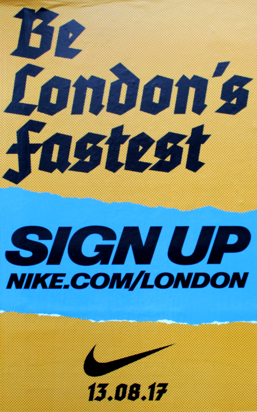
Photo: Luke Freeman. License: All Rights Reserved.
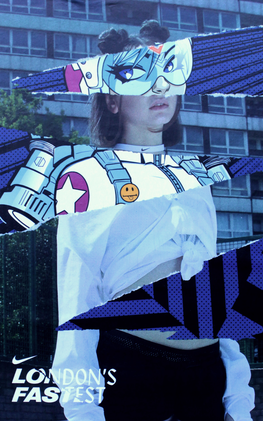
Photo: Luke Freeman. License: All Rights Reserved.


7 Comments on ““London’s Fastest” poster campaign by Nike”
What looks like a black italic Helvetica Extended is actually Nimbus Sans D Diagonal. While Nimbus Sans is URW++’s version of Helvetica, this style seems not to be included in any font family named Helvetica. It also exists in slightly different form as Berthold Standard Diagonal. I wonder about its provenance. The vendors are not very helpful in this regard: “Designer: Haas Studio, (Max Miedinger), 1994, (1970)” [URW++], and “Designer: H. Berthold” [BertholdTypes]. Linotype’s Neue Helvetica 83 Extended Heavy Oblique or 93 Extended Black Oblique are quite different, and a lot less dynamic.
From top to bottom: Nimbus Sans D Diagonal, Berthold Standard Diagonal, Neue Helvetica 83, Neue Helvetica 93
See more images on Radar Radio and in Shameek A. Farrell’s Twitter timeline:
See also the post about the event, with pictures from the projections on the walls of the Turbine Hall at Tate Modern.
There is apparently according to Google Books a 1974 article that mentions it in Typographische Monatsblätter headed “Ein Exklusivprogramm moderner Schriftvarianten zu «Klassischen» Schriften; vorgestellt von Visutek.” Google Books’ OCR snippet: “Auch die Schriftgiessereien stellten sich auf die modische Entwicklung ein und führten, wie zum Beispiel die Firma D. Stempel AG in Frankfurt, den Neuguss einiger ‹Kabel› Schnitte durch oder entwickelten, wie die Haas’sche Schriftgiesserei in Münchenstein, Ergänzungsschnitte zu bestehenden Satzherstellung Schriftfamilien, die nur für Titelsatzgeräte angeboten wurden, so zum Beispiel die ‹Helvetica Diagonal›.” That seems like a similar account to URW++'s 1970 date.
I also notice that whoever drew (or redrew, or digitised) it gave it a comma-ç, which I believe Berthold was quite fond of (well, maybe not always). In the modern Nimbus Sans family it’s notable how ç varies form from weight to weight, as if they come from different sources.
Thank you, Blythwood, excellent digging! Helvetica Diag also appears in a predigital specimen together with other, partly numbered variants incl. Helvetica 4, 5, 5½, 6, 7, 7½, 8, shown in a talk by Riley Cran (from 5:55) at Typographics 2016. Unfortunately Riley didn’t include the source in his slide. I’ll ask him whether he recalls it.
Riley writes:
Here’s Ed Benguiat in conversation with Debbie Millman, saying he “had to draw a hundred and twenty Helveticas. It took me two years.” I don’t know when this was, but Photo-Lettering’s “Haas Helvetica Diagonal” (along with many other variants) appears in their One Line Manual of Styles from 1971, marked as “Typeface or equivalent – non-exclusive”.
Can Haas really have sold Helvetica offshoots done by Ed Benguiat…? That would be glorious, but there’s a joint interview in Print of Benguiat and Vignelli in 1991 discussing his Helvetica offshoots-he’s asked “For the Haas foundry?” and says “No, for Photo-Lettering.” But I suppose that doesn’t rule out a licensing deal.
I was curious and reread Helvetica Forever-it doesn’t seem to cover Helvetica Diagonal but page 63 (the section written by Axel Langer) comments ”[Linotype] held the exclusive rights to market Helvetica as a typesetting machine typeface…Linotype only allowed the Haas Typefoundry the freedom to license Helvetica to the manufactures of the so-called photographic headline setters that were mainly used to produce newspaper headlines and minor printed matter."