
University of Oxford visual identity
Contributed by Stone Clark on Jun 5th, 2017. Artwork published in
circa 2007
.
License: All Rights Reserved.
License: All Rights Reserved.
Source: www.ox.ac.uk License: All Rights Reserved.
“The word OXFORD is a specially drawn typeface while all other text elements use the typeface Foundry Sterling.”
Source: www.ox.ac.uk License: All Rights Reserved.
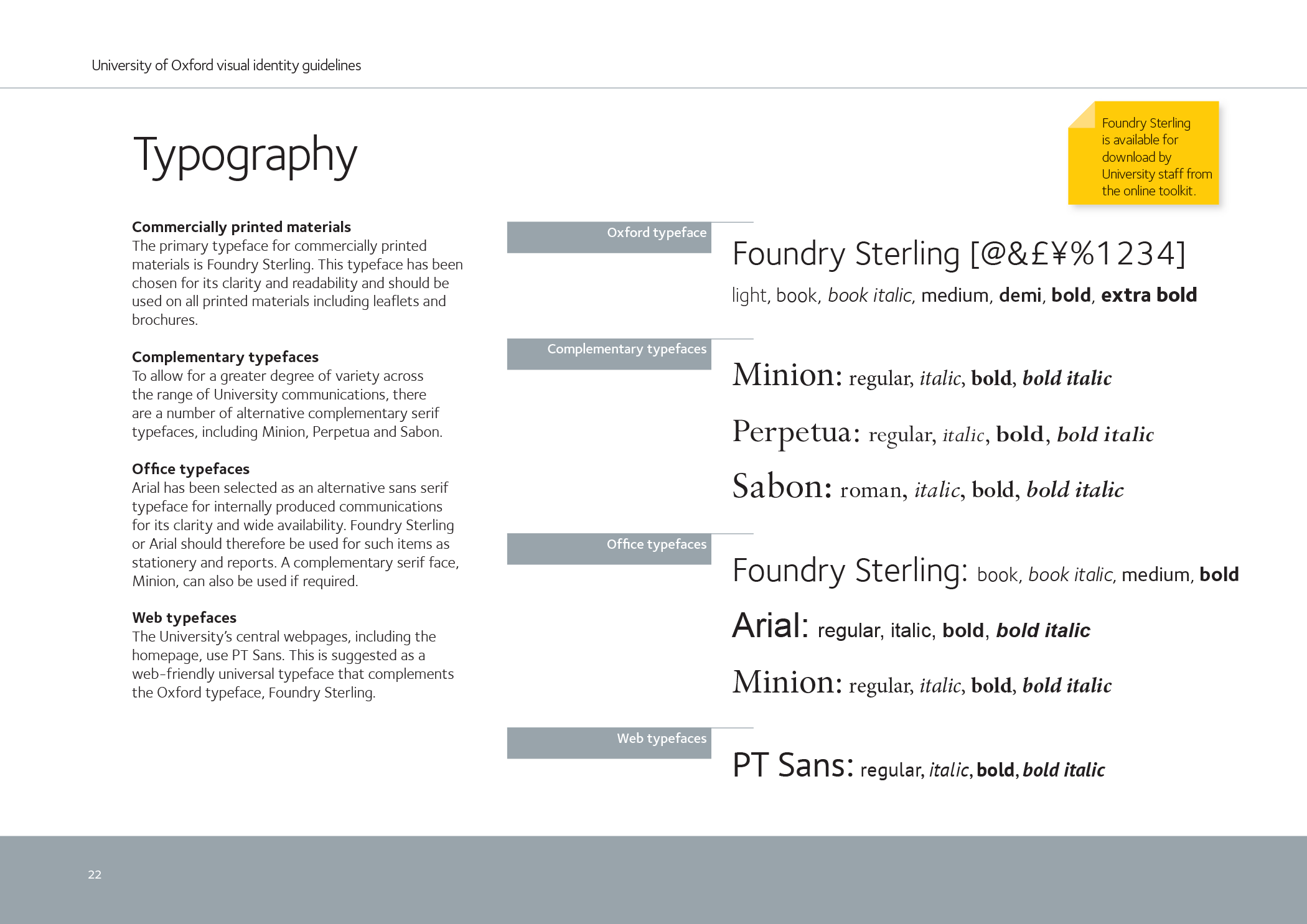
Foundry Sterling was “chosen for its clarity and readability and should be used on all printed materials including leaflets and brochures. To allow for a greater degree of variety across the range of University communications, there are a number of alternative complementary serif typefaces, including Minion, Perpetua and Sabon.”

License: All Rights Reserved.
The belted crest is a traditional device featuring elements from the arms of the University including three crowns and an open book with the motto ‘Dominus illuminatio mea’ (the Lord is my light) set in Minion.


")


6 Comments on “University of Oxford visual identity”
I’m a former employee and the redesign is older than that, although I can’t remember exactly when or who did it. The website seems to have been redesigned in about spring 2008 and the current branding page dates to summer 2007 according to the Wayback Machine, which sounds about right to me although I can’t seem to find a press release announcing it.
Foundry Sterling looks lovely; it’s a shame the budget didn’t stretch to a web licence…
Thanks, Blythwood. I’ve updated the estimated date. This led me to reexamine Foundry Sterling’s release date which appears to be 2004, not ’09 as we (and other sources) indicate.
It was announced as early as 2002. (So glad to have access to the Typophile archives again!)
Hm, I don’t see it, Stone. The proportions and serif structure are quite far off.
Jeremy Tankard’s speaking bio mentions having drawn a logotype for Oxford so it might be this one.