Friedrich Rumpfkeil & Söhne invoice, 1919
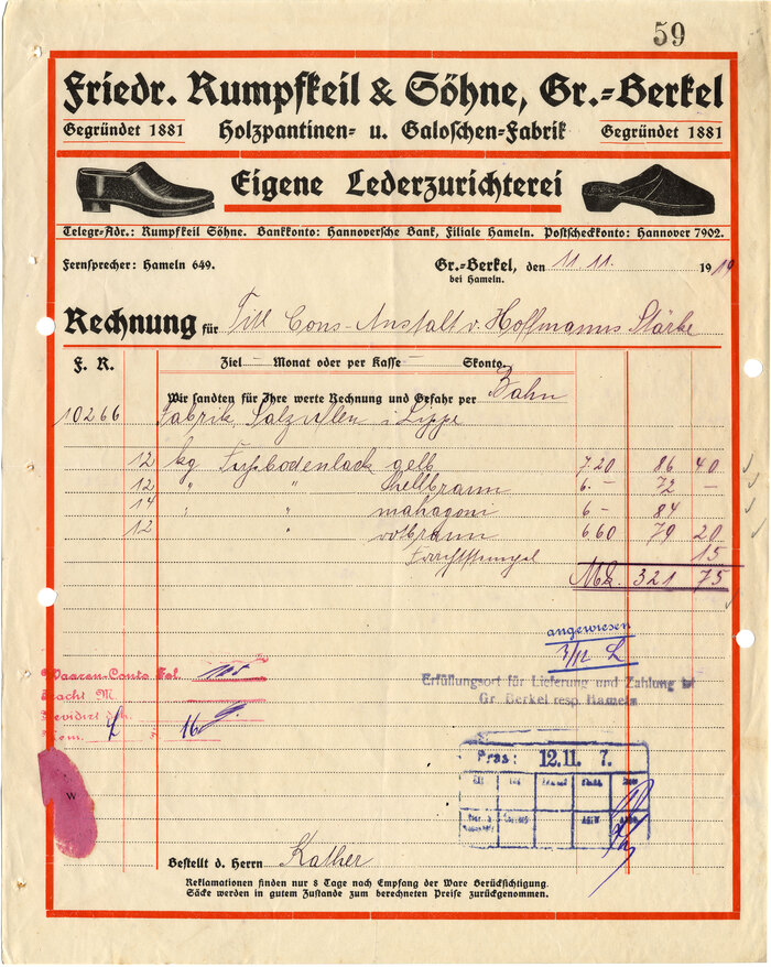
This week’s invoice is a perfect example for what we collect under the “one typeface” tag: a use that is exclusively set in a single typeface. Most vintage invoice designs exhibit a mix of two or more typefaces, for better or worse, and even the few that are restricted to a single typeface family show at least a second weight. This one is different. All of the type on it is the original fett style of Deutsche Schrift, the first typeface by Rudolf Koch, released in 1910 by Gebr. Klingspor and also known as Kochschrift.
It’s not one font, though. In metal type, a font is a given style at a specific size. Six sizes and hence six fonts were used to typeset this document. Between the sizes, there are some remarkable differences in the design of certain letters. For example, the bowl of ‘R’ is closed in the larger sizes, but open in the smaller ones, see the detail image below. Different counter treatment and suppression and emphasis of features are two of the principles guiding the design of optical sizes as described by Shoko Mugikura and Tim Ahrens in their essential book Size-specific adjustments to type designs.
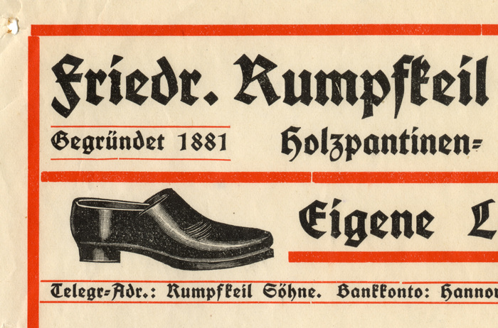
The ‘a’ in Deutsche Schrift fett is particularly interesting. Its optical sizes bridge the borders of blackletter classification. In larger sizes, it has straight sides, as in a textura. However, in sizes of 10pt and below, its left side is curved, as in a schwabacher — and as in all sizes of the lighter weights of the family (the condensed has a double-storey ‘a’ with straight sides). Alter Littera’s single size digitization includes both shapes.
Despite the typographic restraint, the final invoice still hosts a motley crew of letterforms. In addition to the handwriting in roundhand and kurrent (“Frachtſtempel”), there are miscellaneous stamps. I’m fond of the ones with the Ronde script (“Waaren-Conto”, “angewiesen”).
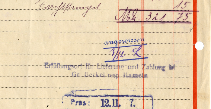
Friedrich Rumpfkeil & Sons was a manufacturer of clogs and galoshes with a leather finishing shop in Groß-Berkel, nowadays part of the municipality Aerzen in the Hamelin-Pyrmont district, Lower Saxony. This invoice is not for shoes, but rather for 50 kg of floor lacquer in various colors. The recipient is the “Cons(um)-Anstalt von Hoffmanns Stärke”, a company-owned shop founded in 1879 to supply the 1,000 employees of Hoffmann’s Stärkefabriken in Salzuflen with all kinds of consumer goods on-site.
Formats
- Ephemera (1033)
Topics
- Product (1592)
- Fashion/Apparel (1290)
Designers/Agencies
- unknown (3281)
Tagged with
- shoes/footwear (82)
- invoices (54)
- letterheads (344)
- red and black (998)
- borders and rules (918)
- 1910s (60)
- blackletter (254)
- two-color (849)
- one typeface (1610)
- optical sizes (304)
- metal type (129)
- handwriting (137)
- job work (202)
- Weimar Republic (88)
Artwork location
- Germany (3265)
- Groß Berkel (1)
- Aerzen (1)


