Hitachino Nest Beer
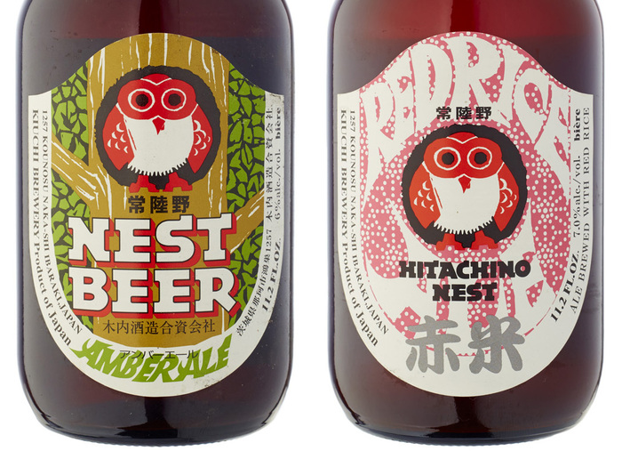
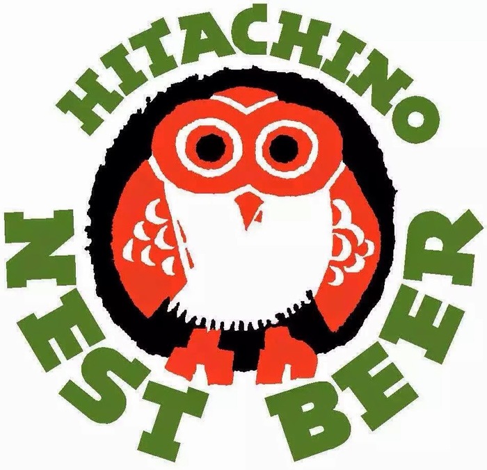
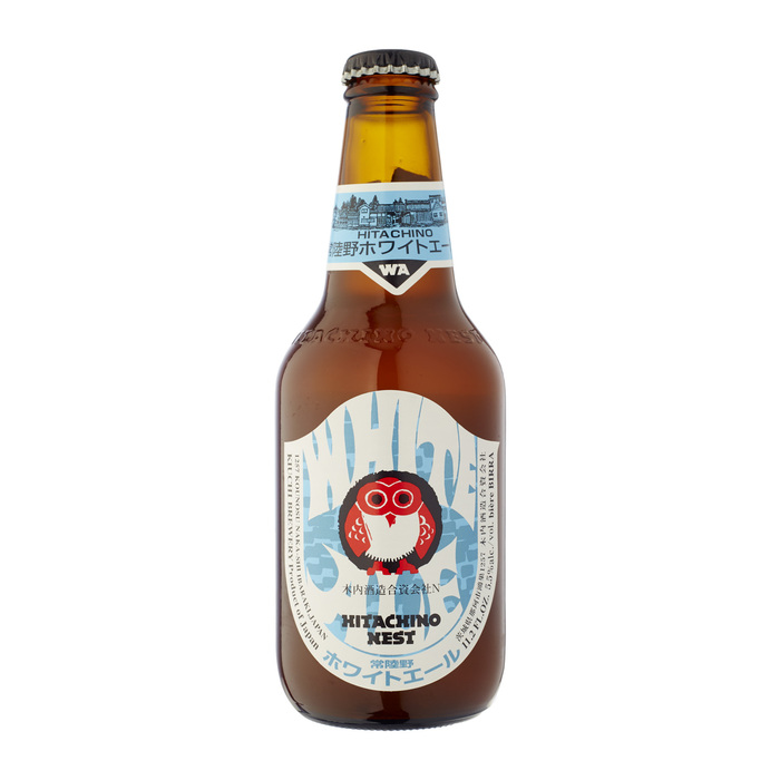
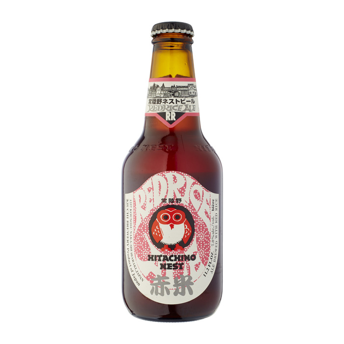
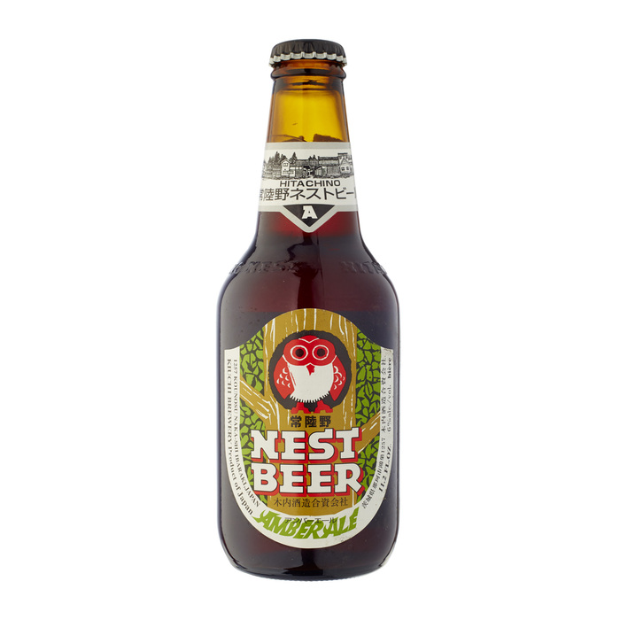
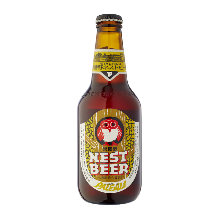
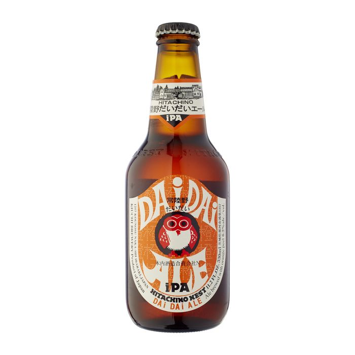
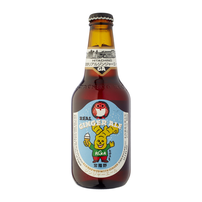
Everything about Hitachino Nest Beer stands out among other ale bottles, from the adorable Japanese woodblock owl, to the psychedelic fit-to-shape lettering (e.g. Red Rice), to the bold, constructivist, semi-slab Epokha, a 1992 Letraset face that’s seldom seen these days.
The brilliant designers are unknown to us, so if anyone has information, please comment! They made a few modifications to Epokha to make it Hitachino’s own, adding subtle curved bracketing to all the serifs in the “NEST BEER” logo, and more slabs to the first ‘N’.
“Kiuchi Brewery (木内酒造) is a brewery in Naka, Japan established in 1823 by village headman Kiuchi Gihei as a sake and shochuproducer. Craft beer production began in 1996 after a change in Japanese law governing micro brewing. A number of Kiuchi’s products seek to combine European beer-making technology with traditional Japanese brewing techniques.” — Wikipedia
Formats
- Packaging (1983)
- Branding/Identity (6668)
Topics
- Food/Beverage (2555)
Designers/Agencies
- unknown (3281)
Tagged with
- Kiuchi Brewery (1)
- beer (182)
- beer labels (110)
- beer bottles (56)
- modified typeface (1465)
- playful (194)
- center-aligned text (1565)
- lettering (539)
- type on a circle (721)
- logos (3876)

