
Chocolat Breitling candy tin

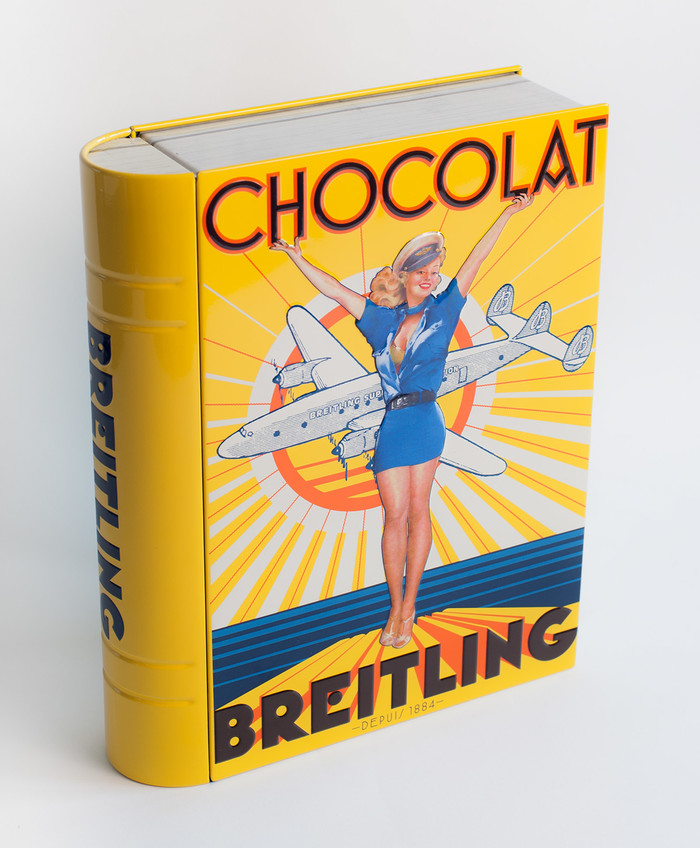
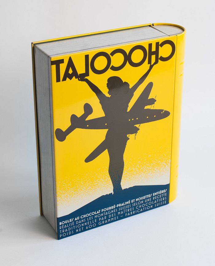
For the 2015 holidays, the Breitling watch company sent clients a box of chocolate. But they didn’t just slap their logo on some black cardboard and call it a day. Jeremia Adatte designed a colorful WWII-era tin with vintage pin-up and Art Deco influences. The retro art is meant to charm (Adatte chose a relatively tasteful representation of a genre that was inherently sexist), but it’s the thoughtful type choices and treatment that really drew my attention.
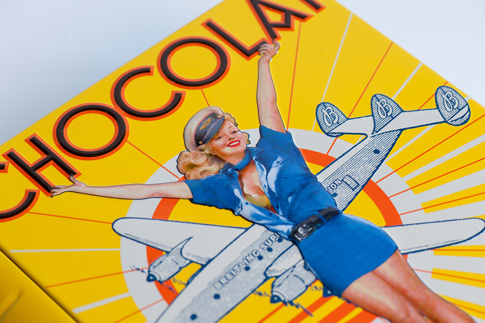
The exterior of the tin is set entirely in Mostra Nuova. Mark Simonson’s type family already includes an extensive range of alternates, but Adatte made some of his own lettering-inspired modifications to a few of the glyphs. For example, to establish a custom logotype for this fictional brand of chocolate, three holes are punched into Mostra Nuova’s ‘BR’, and a dot replaces the middle of the ‘E’. A 3-dimensional extrusion effect completes the look.

To establish a custom logotype for this fictional brand of chocolate, three holes are punched into Mostra Nuova’s ‘BR’, and a dot replaces the middle of the ‘E’. A 3-dimensional extrusion effect completes the look.

The sticker on the inside of the box lid is another fairly convincing throwback design using type by comic book lettering experts Comicraft (Rocketship from Infinity), and a typical advertising script (Leader) which comes directly from the archives of Filmotype, a pioneering phototype company founded in the 1950s.
These type genres are perhaps a decade too late in comparison to the Deco-style exterior of the tin. Leader is a very nicely drawn and authentic freehand script, but it’s more mid-’50s than ’40s. Still, it’s close enough, and by the time Breitling’s recipients saw this sticker they were certainly too busy diving into the chocolates to notice or care.
Overall, it’s a warm and lovingly crafted promotional gift celebrating Breitling’s roots in aviation (the company built onboard chronographs for Royal Air Force cockpits). I wouldn’t complain if it landed in my mailbox.


")


