
ATF Keepsake 2012: Psalm 51
Contributed by Stephen Coles on May 28th, 2016. Artwork published in
.

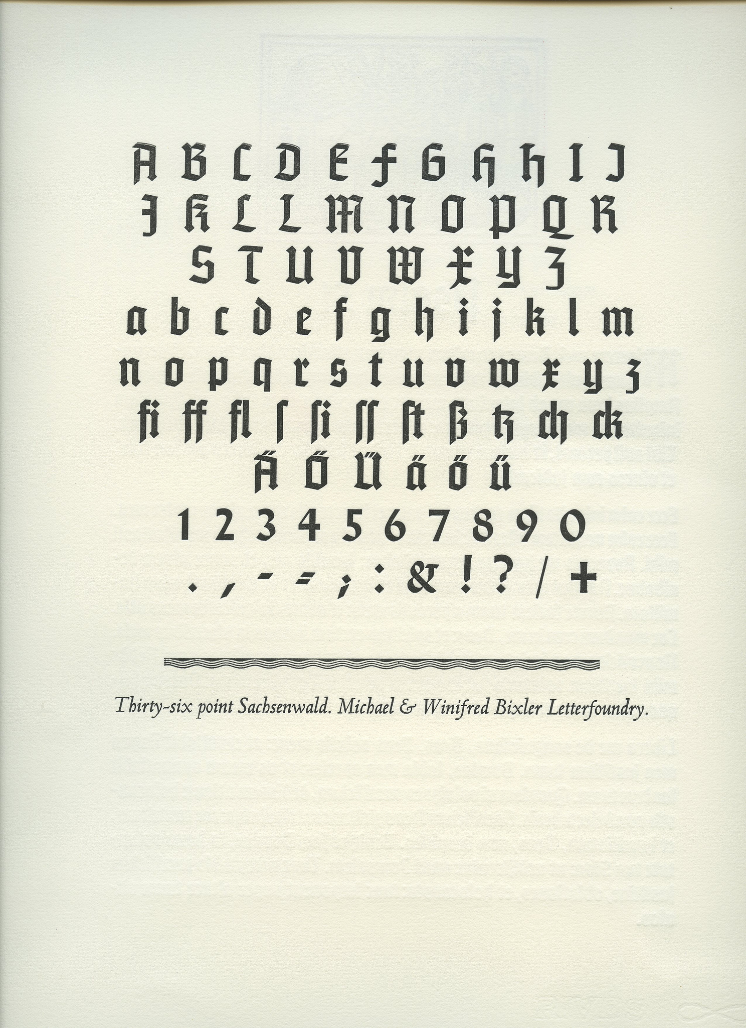
This 2012 Keepsake for the American Typecasting Fellowship was printed by Alan Dye of Noble Impressions Press using 16 and 36 point Sachsenwald. This blackletter is a lesser-known Berthold Wolpe face designed in the early 1930s before Wolpe fled Germany to England. Monotype in London released it in 1937, on the eve of World War II, but it was officially discontinued in 1967 and fell into obscurity until it was recast in 2007 by the Michael & Winifred Bixler Letterfoundry.

Photo: Norman McKnight. Keepsake: Alan Dye. License: All Rights Reserved.
Cropped detail.
“There were apparently only two sets of matrices ever made, & only one of them is known in use & is provided by the Michael & Winnifred Bixler Type Foundry.” — Ephimeros


")


 movie posters")


")

")


8 Comments on “ATF Keepsake 2012: Psalm 51”
Can anyone share some insight on the weight range of Sachsenwald? In his compilation for the Klingspor-Museum (pdf), Hans Reichardt lists three weights; Sachsenwald-Gotisch (1936), halbfett (1938), fett (no date), all for Monotype. Antonio Cavedoni kindly shared a list of Wolpe’s typeface designs that is included in Sue Fowler’s dissertation at the University of Reading, supervised and annotated by Wolpe himself. This typewritten chronology includes Sachsenwald with a 1937 date. A handwritten addendum mentions “Sachsenwald Light/Bold”. So Wolpe must have designed at least two (L/B), maybe three (L/[R]/B) weights — but were they ever produced?
Ask this person? She seems to have read through the Monotype archives on the production history.
Thanks for reminding me of Sarah Bryant’s absorbing investigation! I have asked her.
The dates for the regular weight are also muddy. Reichardt may be referencing a design (not release) date when he says 1936. It was renamed in 1937 and advertised in the Monotype Recorder that year. Bryant’s photos of the production notes clearly show that the initial style (Series 457) was still in development until well into 1938, though a first release (in some sizes perhaps) probably came earlier.
Incidentally, that is some amazingly lovely handwriting throughout Bryant’s set of photos of the Monotype working notes. I remember finding Dan Rhatigan’s blog post and article on the Monotype drawing office team very interesting for background.
Sachsenwald was originally commissioned by Ullstein, a German publisher, in 1936, but they had to leave the project behind in mid 1937. It was originally called Bismarck Schrift but later renamed to Sachsenwald when Ullstein left and Monotype decided to release it to general market. I suspect that the 1937 recorder article on blackletter might have been an attempt to raise awareness of blackletter and promote the typeface early.
To answer the original question, there were only two weights: Regular and Mager (Light). There never was a third weight, and the weight shown in the Klingspor PDF is the Regular. At Monotype archive, there is a drawing and proof of Light, but I do not know if it was ever released. There is no clear sign of cencellation mid production but I have not seen it in use at all.
Thank you for the extra info, Toshi! It’s much appreciated.
Yes, I had learned about the Ullstein connection from Sarah’s blog post. I’ll repost my comment here:
Professor James Mosley added some extra comments to Ms. Bryant’s article recently which are interesting reading, although they mostly recap Mr. Hardwig’s information above.
I’m going to visit the Wolpe exhibition in London this weekend that Monotype are putting on to mark their release of a series of Wolpe digitisations, so would be happy to check/photograph anything that’s there.