
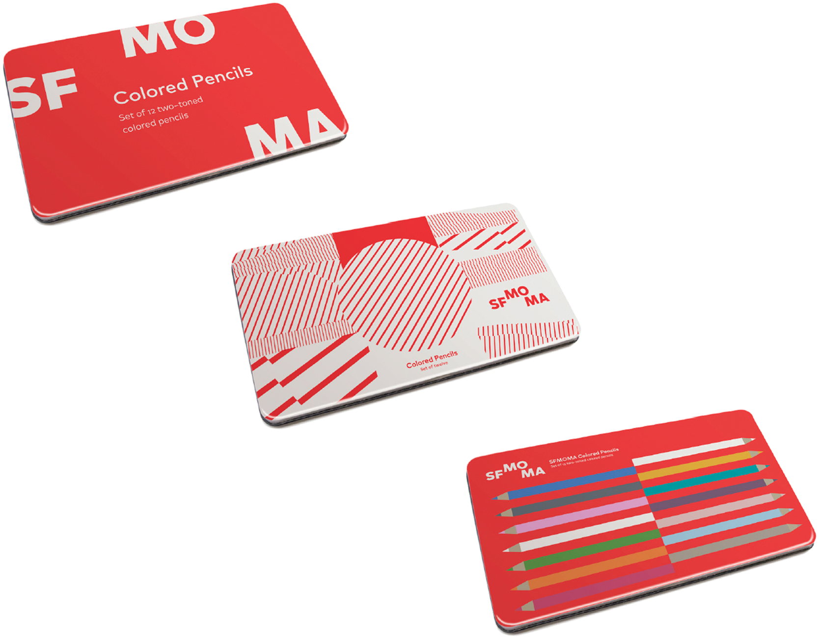
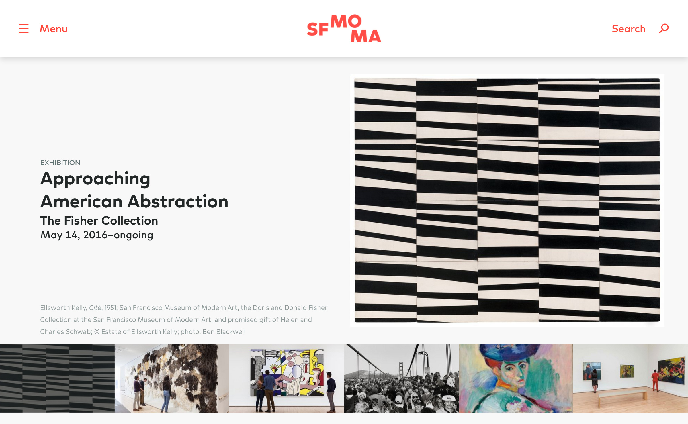
San Francisco Museum of Modern Art (2016 identity)

Coinciding with the renovation of their building in downtown San Francisco, the SFMOMA redesigned their logo and identity using a modified FF Mark, and an entirely new custom version specifically for text use drawn by FF Mark’s codesigner Christoph Koeberlin.
Credits:
Jennifer Sonderby, Design Director, leads the SFMOMA Design Studio, whose team includes Bosco Hernandez, art director; James Provenza, senior designer; the designers Sophine Lim, Amy Yu Gray, and Mathieu Stemmelen; and project coordinator Carrie Taffel.

![“To create SFMOMA Text, Koeberlin increased the [x-height]. By elongating the letters and eliminating their perfectly rounded circles, some of the pronounced distractions were removed. A double-story ‘a’ was introduced to provide a distinctive letterform that wouldn’t be confused with ‘o’ or ‘c’ and would allow for faster ingestion of text.”](https://fiu-original.b-cdn.net/fontsinuse.com/use-images/39/39084/39084.png?filename=HnlrZvFuCXjL.png)
“To create SFMOMA Text, Koeberlin increased the [x-height]. By elongating the letters and eliminating their perfectly rounded circles, some of the pronounced distractions were removed. A double-story ‘a’ was introduced to provide a distinctive letterform that wouldn’t be confused with ‘o’ or ‘c’ and would allow for faster ingestion of text.”


“The letters in our logo served as the inspiration for SFMOMA Display, which adopts their open shapes and gracious curves. SFMOMA Display is distinguished by the splayed legs of its ‘M’, the lower counter of the ‘A’, and the sinuous curves of the capital ‘S’. And be sure not to miss the sleekly modern ‘Q’!”


")

")


3 Comments on “San Francisco Museum of Modern Art (2016 identity)”
Beautiful work! It’s a pity that we cannnot use this font. By the way, I love Fonts in Use. It’s the best site to discover fonts! Keep working. Cheers!
Very simple but effective. Nice work. Just one question: I can see two different forms of the capital letter ‘i’ in the alphabet showing. Why?
Thank you.
Such a barred ‘I’ is typically used in contexts where unambiguity is crucial, like archive numbers, passwords and other random alphanumeric strings. It is also used to distinguish the roman numeral ‘I’.