
ZB MED identity
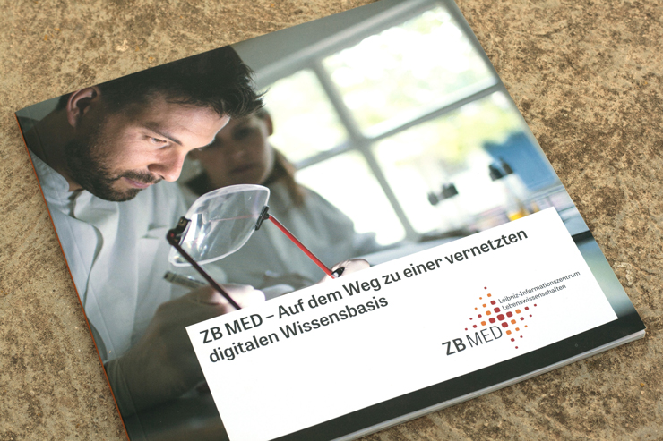
The German National Library of Medicine (ZB MED – Leibniz Information Centre for Life Sciences) is Germany’s central service centre for specialist information and research support in the field of life sciences. At more than 1.6 million volumes, ZB MED has the world’s largest library in its combination of subjects: spanning from medicine, health, and healthcare systems to nutritional, environmental, and agricultural sciences.
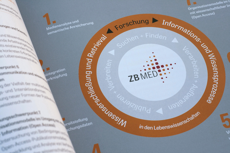
ZB MED hired the German designer Sabina Sieghart to design the new corporate identity, including an entirely new strategy and branding in line with their four areas of unique expertise, and studio 3pc was hired to implement their website. To lend credence and approachability to ZB MED, Tablet Gothic Narrow and Abril were chosen for the website and all print materials. Tablet Gothic Narrow can be seen in menus, texts, and headlines, and Abril is used in menus and short texts, usually in italics.
See more images on Flickr.


")


