
Zetten en drukken in de achttiende eeuw
Contributed by Matthijs Sluiter on Jan 28th, 2016. Artwork published in
.

Photo: Matthijs Sluiter. License: All Rights Reserved.
“Typesetting and Printing in the Eighteenth Century” is the first edition of a never before published manuscript by typographer David Wardenaar (1747–1826), written between 1796 and 1801, under the title Beschrijving der Boekdrukkunst (“description of the art of printing books”). Introduction and notes by Frans A. Jansen; typeset in Bobst Baskerville at Joh. Enschedé & Zn; typography by Bram de Does. The shaded caps used on the jacket and the title page were cut by Jacques-François Rosart at Enschedé in 1759.

Photo: Matthijs Sluiter. License: All Rights Reserved.

Photo: Matthijs Sluiter. License: All Rights Reserved.

Photo: Matthijs Sluiter. License: All Rights Reserved.
The calligraphic lb ligature – an abbreviation for pound, in Latin: libra – doesn’t quite match the text. This symbol is included in Unicode as ℔ (l b bar symbol).

Photo: Matthijs Sluiter. License: All Rights Reserved.
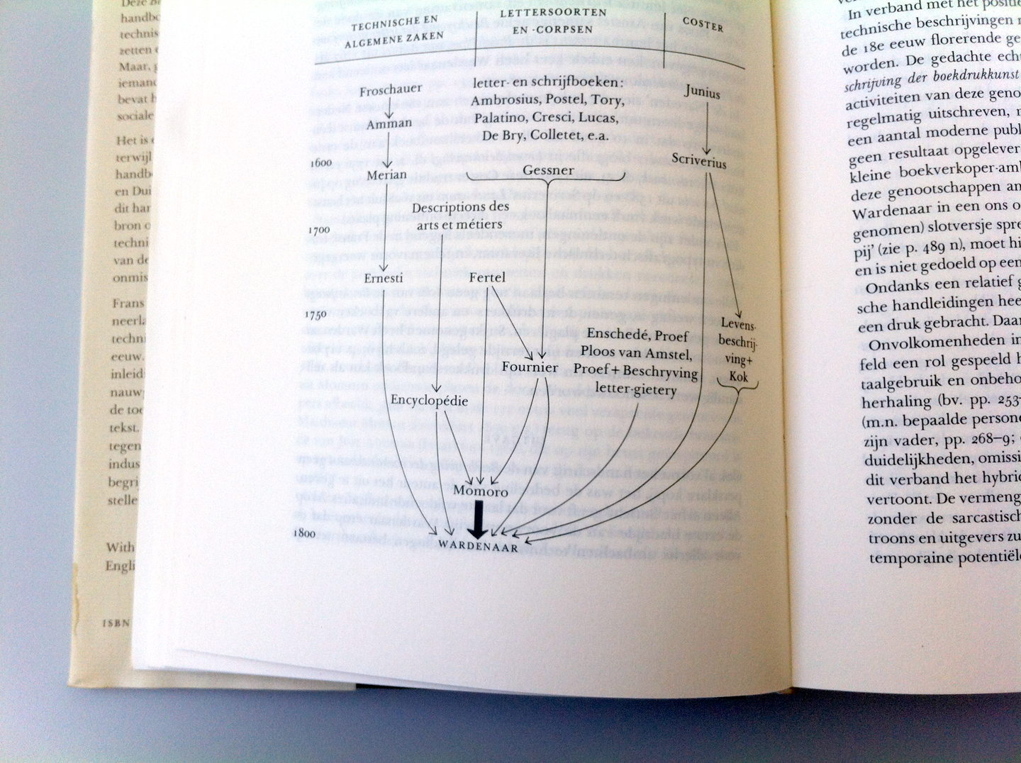
Photo: Matthijs Sluiter. License: All Rights Reserved.

Photo: Matthijs Sluiter. License: All Rights Reserved.


")


