
Harlem Song marketing and album
Contributed by Sam Berlow on Jan 19th, 2016. Artwork published in
.

Source: www.gailycurl.com License: All Rights Reserved.
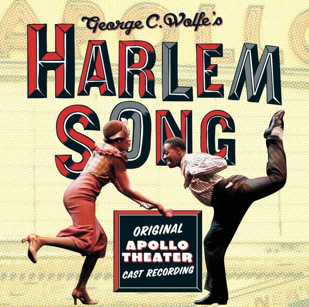
One of Gail Anderson’s first projects as Creative Director of Design at SpotCo, a NYC-based advertising agency that focuses on the entertainment industry.
License: All Rights Reserved.


6 Comments on “Harlem Song marketing and album”
This is a fun mix of type inspired by screen printed and wood type posters of yore. The red shadow on Radio doesn’t work so well, though.
The main type appears to be inspired by Dimensional, a Photo-Lettering design by Dave Davison (see also Double D NF). As a reference to the frequent flipping of marquee lettering, the ‘M’ is a rotated ‘W’.
Davison Dimensional (above) may have been modeled after a typeface cast by Besley (Fann Street Foundry) in c.1860. The two letters reproduced as #210 in Nicolete Gray’s Nineteenth Century Ornamented Typefaces (2nd ed., 1976) are shown below.
See also 5 Line Gothic Cond. Octagon Shade (Wells & Webb).
Here’s another 19th-century appearance:
Maybe it’s time for a new entry for the source typeface.
There’s a new entry now, under the name Octagon Gothic Condensed Shaded. It’s a generic entry for all 19th-century versions, including Besley’s foundry type and the wood type cuts.
For Harlem Song, Gail Anderson referenced one such source: The version she used is David Rakowski’s freebie Tejaratchi (1992), which is based on the 19th-century design, not PLINC’s Davison Dimensional. In the latter, O isn’t quite straight-sided, E has a longer middle bar, A has a larger counter, etc. I’ve updated the typeface credit.
Romanian manufacturer Wood Type Customs offers a wood type version of Octagon Gothic Condensed Shade.