
Pubblicità in Italia, 1964–1965
“Advertising in Italy is an accurate look at Italian graphic design in 1964–65 including: posters, advertising, catalogs, packaging, trade-marks and more. Introduction by Carlo Munari with collaboration from: Antonio Boggeri, Dino Villani, Massimo Alberini and Gianni Bordoli.” — Display
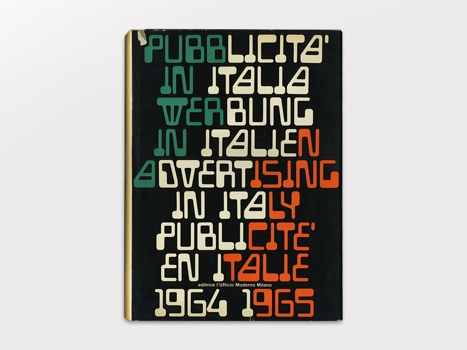
The typeface in use appears to be Gemini Computer or a predecessor. The origins of this MICR-style design are unknown, but this is the earliest use we’ve documented so far. [See comments] This example differs from later examples of Gemini in various ways: the bottom of the ‘A’ is closed in, the ‘E’ is entirely monolinear, the ‘G’ is simplified, and the numerals have unique shapes. Perhaps these are customizations by Grignani (he flipped the ‘N’ in “IN”) but these forms do appear in other publications of the day, such as 1965’s The New Improved American (Delta edition).


")


")


")


8 Comments on “Pubblicità in Italia, 1964–1965”
Anyone know if this playboi got digitized ???????
See the typeface page: Auto Mission is a digital revival. This freebie comes with a limited character set, though.
Franco Grignani, as early as in 1964, drew the Magnetic font, inspired by the IBM numbers and printed with magnetic inks: “I had the doubt of the lack of legibility (although I had used them for the cover of “Pubblicità in Italia 1964–1965”) but in 1966 these characters were taken up in America and transferred to photocomposition and immediately applied to the futuristic titling in thousands of publications”.
from www.aiap.it/cdpg/?ID=7423&I…
Oh wow, that’s an excellent find! Thank you for sharing, Emiliano!
Alright, so this cover does not really show a font in use, but rather Grignani’s custom lettering, before it was made into a typeface. My hunch is that the mentioned American company that adopted the style for photocomposition is Filmotype, and that it’s there where it got the name Gemini. I haven’t found a hard proof for that yet, but Gemini is shown in a Filmomaster catalog from around 1974. If anyone knows of a mid-/late-1960s Filmotype catalog, please let us know if Gemini is included.
We recently found a statement written with the calligraphy of my grandpa with which I can definitely confirm that 'Magnetic’ typeface was just a single experiment, one of the many that Franco Grignani made up for pure experimentation in graphic advertisement. I posted: “Designed in 1964 ONLY to compose this writing. In America, having been copied, the typeface was released in 1966.” The fact that he wrote ONLY in capitals lets us guess that the problem of the authorship of this font had already arisen in the past.
The aforementioned link (Aug 16th, 2020) is broken and should be substituted with: https://aiap.it/2000–2020/cdpg/index%EF%B9%96ID=7423&IDsubarea=169&IDsez=184.html
I found an early use (1968) of this typeface in Italy in the setting of the 14th Triennale of Milan in a project signed by Joe Colombo; see: www.bdl.servizirl.it/bdl/bo… and following.
Great info, Emiliano, thank you! It’s certainly possible that Filmotype was directly inspired by Grignani’s work, as their catalog was filled with styles that came from a variety of sources.
I have updated Atwin (my own digital interpretation of Gemini) to include the alternate letters here (but not numbers). Which means i can do this likeness:
Kerning and spacing is as encoded in the font file, unadjusted.