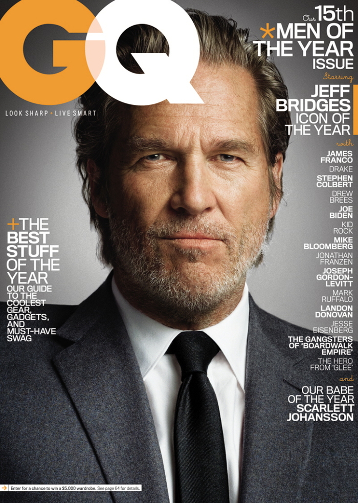
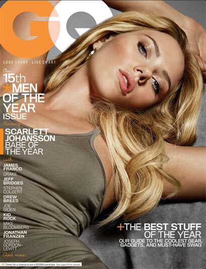
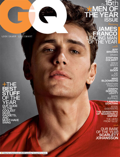
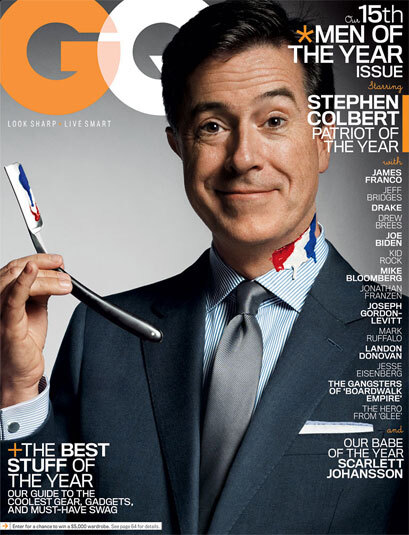
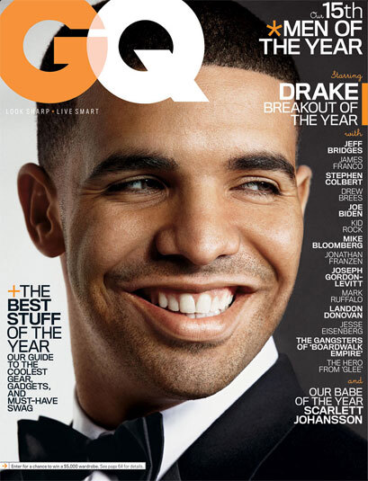
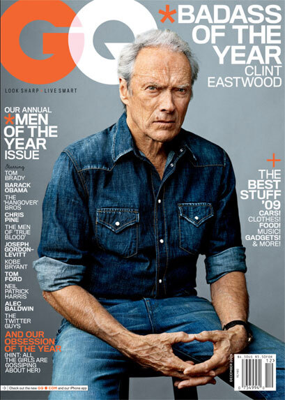
GQ Dec. 2010 “Men of the Year” covers
Contributed by Font Bureau on Feb 14th, 2012. Artwork published in
.
Formats
- Magazines/Periodicals (1611)
Topics
- Lifestyle (1198)
Tagged with
- GQ magazine (14)
- magazine covers (1185)
- men’s magazines (40)
- sexist (10)
- celebrities (61)
- all caps (5975)
- tight letterspacing (735)
Artwork location
- United States (8315)





















5 Comments on “GQ Dec. 2010 “Men of the Year” covers”
Is it just me or does the type layout of these covers look horrible. All caps and smashed together.
Joe, you are 100% correct and it is hard to read. My daughter, a graphic designer, sent me this and never mentioned the type layout. And that is one of her biggest complaints about the print world: They don’t understand fonts and type setting.
looks damn good to men. The cover was designed for MEN.
I agree guys. Only the picture does the job. The type isn’t fine tuned, too much text for a cover IMO.
I see what you guys mean about the type, but it’s not a fair comment that the print world doesn’t understand type. It’s actually web typography that has recently started catching up to print sophistication.
Given the necessarily flexibility of web, it will take a long time before our browsers start seeing the same output as a skilled type craftsman.