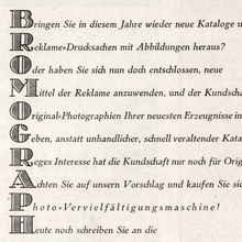
Designed by Friedrich Bauer and issued in 1907–1910 in
7 styles (3 weights, 2 of them with italics, plus
2 condensed weights). [Seemann]
Initially (until 1912) named Nordische Antiqua (Swedish:
Nordisk Antikva). Developed in cooperation with
Swedish printer Waldemar Zachrisson [DBS]
who sometimes is credited as designer. [Onze
Kunst] Accompanied by Seeland-Initialen and
Seeland-Ornamente drawn by Gerhard Heilmann. [DBS]
Used in 1907 for Genzsch & Heyse’s Bunte Blätter,
Vol. 3 No. 1. [DBS]
First used for a full book in Zachrisson’s
Boktryckeri-Kalender [DBS,
1907]
In 1916, Genzsch-Antiqua with Kursiv and halbfett
were cut in a Cyrillic version. Large sizes of some styles also
made in wood. In 1929, Genzsch & Heyse added another 3 italic styles in a revised version for
newspaper use as Genzsch-Zeitungs-Kursiv.
Rosenborg-Kursiv (1910) is an italic variant with
swash caps. [Reichardt, Seemann]
Also cast by Berling as Nordisk antikva and by
Stevens as Stanhope Old Style. [Reichardt,
R. H. Stevens] Some styles adapted for the Intertype
[Musterkartei DIN 16507] and also Linotype/Typograph [Reichardt]
Not to be confused with Linotype’s Nordische Antiqua,
which was their adaptation of Turnus-Antiqua (Stempel,
1910). Taken over by Bauer. [1963
correspondence]
In 1995, Sven Seddig and other students at the Hochschule für
bildende Künste in Hamburg digitized the roman, under the direction
of Gisela Will More…
Designed by Friedrich Bauer and issued in 1907–1910 in 7 styles (3 weights, 2 of them with italics, plus 2 condensed weights). [Seemann] Initially (until 1912) named Nordische Antiqua (Swedish: Nordisk Antikva). Developed in cooperation with Swedish printer Waldemar Zachrisson [DBS] who sometimes is credited as designer. [Onze Kunst] Accompanied by Seeland-Initialen and Seeland-Ornamente drawn by Gerhard Heilmann. [DBS] Used in 1907 for Genzsch & Heyse’s Bunte Blätter, Vol. 3 No. 1. [DBS] First used for a full book in Zachrisson’s Boktryckeri-Kalender [DBS, 1907]
In 1916, Genzsch-Antiqua with Kursiv and halbfett were cut in a Cyrillic version. Large sizes of some styles also made in wood. In 1929, Genzsch & Heyse added another 3 italic styles in a revised version for newspaper use as Genzsch-Zeitungs-Kursiv. Rosenborg-Kursiv (1910) is an italic variant with swash caps. [Reichardt, Seemann]
Also cast by Berling as Nordisk antikva and by Stevens as Stanhope Old Style. [Reichardt, R. H. Stevens] Some styles adapted for the Intertype [Musterkartei DIN 16507] and also Linotype/Typograph [Reichardt] Not to be confused with Linotype’s Nordische Antiqua, which was their adaptation of Turnus-Antiqua (Stempel, 1910). Taken over by Bauer. [1963 correspondence]
In 1995, Sven Seddig and other students at the Hochschule für bildende Künste in Hamburg digitized the roman, under the direction of Gisela Will and Hans Andree [Materialverlag].
Commercial digitizations were made by Bo Berndal as Nordik (Agfa, 1992) and by Gerhard Helzel (1995–2005, 5 styles). In 2016, Michael Wörgötter digitized the schmalhalbfett and made a wood type revival, and eventually revived all 7 original styles as LD Genzsch Antiqua (Lazydogs, 2020). See also Tarocco and Stanhope.


