
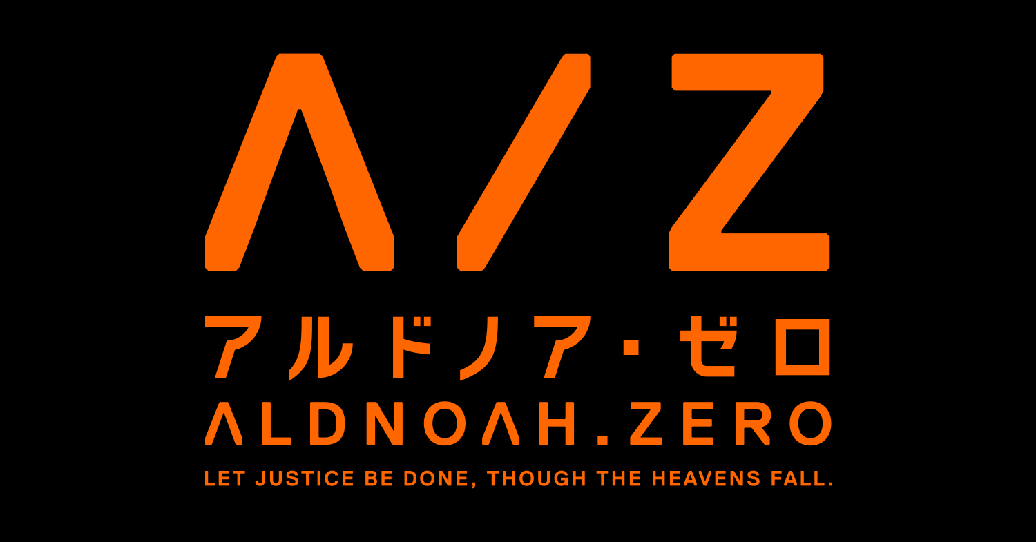
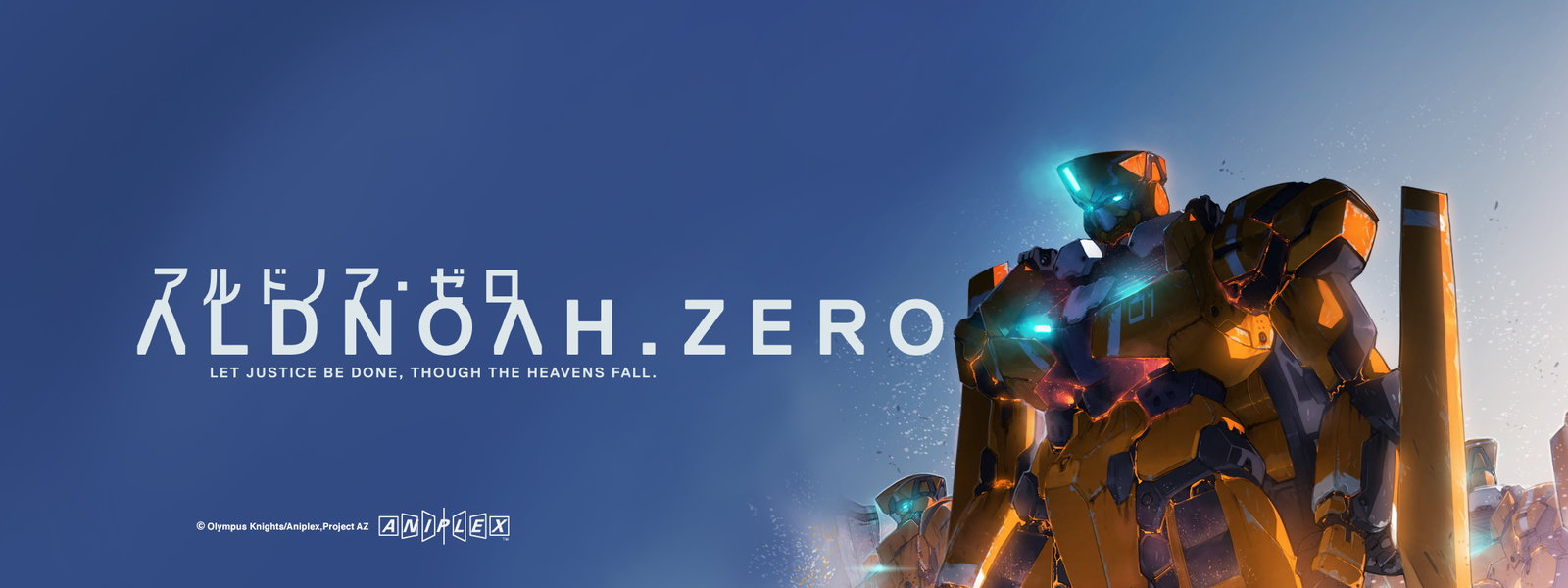
These are promotional images of the Japanese anime Aldnoah.Zero, which began airing on 5 July, 2014. It includes the title of the show in both English and Japanese, as well as an English catchcopy. The English text utilizes Replica font in bold (with a stylized capital A in the title); the Japanese text uses a yet unidentified font.

")


")


3 Comments on “Aldnoah.Zero”
Frutiger Serif is also used on the website.
Aldnoah Zero is kind of a trend-setter in terms of typography in Japanese TV anime. Perhaps for the first time, design specialists are invited: Tomoyuki Arima (有馬トモユキ) and Takuya Sejima (瀬島卓也). Also for the first time it was a conscious decision to collaborate with a type foundry, in this case Type Project, spearheaded by Isao Suzuki (铃木功).
The Japanese Gothic that accompanies Replica in logotypes is Type Project’s AXIS series, designed primarily by Suzuki and mainly targetting on-screen display. Apple Japan’s website uses a (presumably customized) AXIS, renamed in CSS as “Apple TP”.
This typeface family also comes with a Multiple-Master-like solution, first named “Adjustable Font” and later renamed “FitFont”. When it was still named “Adjustable Font”, the customer could probably control the interpolation on width, weight, contrast and height axises locally. After it was replaced by “FitFont”, Type Project’s website allows previewing parametric changes online, and only delivers font files after customization and purchase, effectively taking away the local interpolation capability.
One thing this entry (as of Aug 27, 2016) has not mentioned is that the typeface inside episodes is a serif also by Type Project, named TP Mincho. In addition to its superb contour quality, TP Mincho also comes with low-, medium- and high-contrast sub-families, making it easy to maintain consistency while pairing with different Latin typefaces.
Source: typeproject.com/en/intervie…
Also, Tomoyuki Arima drew the logotype (source).
A-1 Pictures is the animation studio, and “Olympus Knights” is a name for the group of writers behind the anime’s story. Neither are related at all to graphic design.