Personal Money Management by Bailard, Biehl, Kaiser (1973 edition)
Contributed by Stephen Coles on Mar 31st, 2024. Artwork published in
.
Source: archive.org License: All Rights Reserved.
Source: archive.org License: All Rights Reserved.
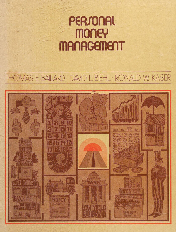
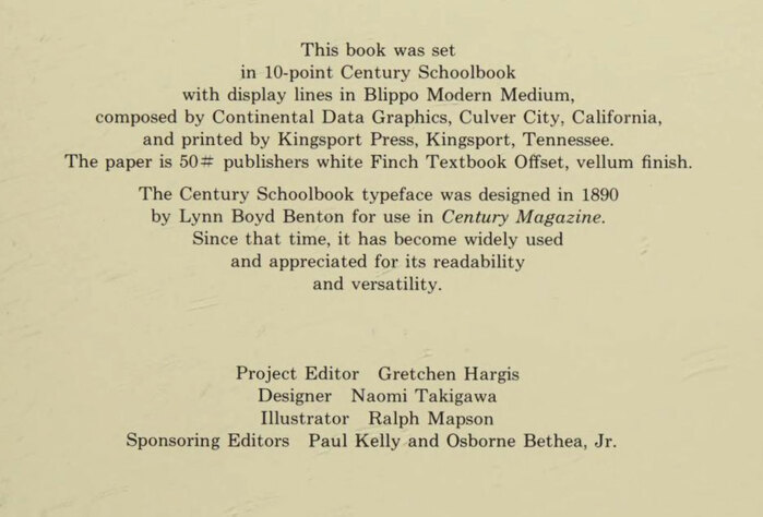
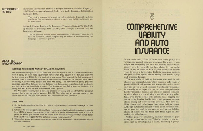
Personal Money Management is a textbook created by Bailard, Biehl & Kaiser Inc., an investment firm in Menlo Park, California. The book was published in many editions, from 1969 to 1992. This 1973 edition was designed by Naomi Takigawa who credited the typefaces Century Schoolbook and Blippo Modern in the colophon. The latter appears to be Facsimile Fonts’ copy of a design that may have originated at VGC as Bubble. Blippo Light [a copy of Harry Thin, see comments] is used for the author names on the cover.
Source: archive.org License: All Rights Reserved.
Source: archive.org License: All Rights Reserved.
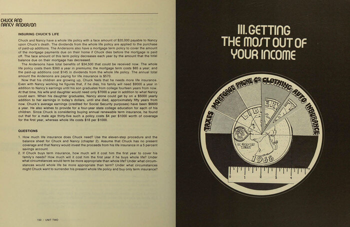
Source: archive.org License: All Rights Reserved.
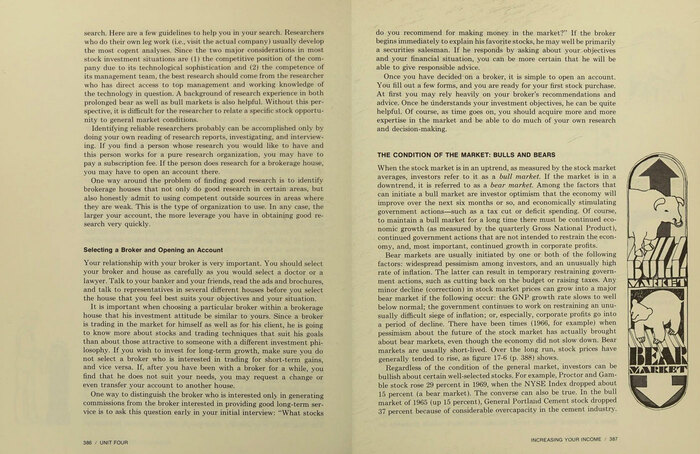
Source: archive.org License: All Rights Reserved.
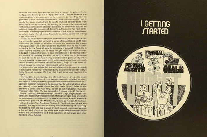
The charming drawings throughout the book are by Ralph Mapson. This one includes lettering inspired by Futura Black.
Formats
- Books (5439)
- Art/Illustration (456)
Topics
- Education/Academia (1809)
- Business/Finance (617)
Designers/Agencies
- Naomi Takigawa (1)
- Ralph Mapson (1)
Tagged with
- textbooks (32)
- finance (88)
- money (21)
- a note on the type (7)
- colophons/imprints (110)
- center-aligned text (1567)
- borders and rules (919)
- lettering (540)
- lettering derived from typeface (633)
- 1970s (1358)
- Science Research Associates (2)
Artwork location
- United States (8328)
- California (236)
- Culver City (3)
















1 Comment on “Personal Money Management by Bailard, Biehl, Kaiser (1973 edition)”
Just like Blippo Modern is a copy of Bubble, most of Blippo’s other styles aren’t original designs either – minor details like potentially added extra alternates aside. As far as I can tell, the first style, Blippo Black, is the only genuine creation – it’s declaredly inspired by (but not identical to) Burko. The Bold follows Burko Bold in many regards. And the Light, Medium and Fat weights are direct copies of Harry’s Thin, Plain, and Fat. Like Bubble, Harry is a VGC original.
Following the line of reasoning you used for Blippo Modern/Bubble, I have adjusted the typeface credit from Blippo to Harry for the Light weight.
Glyph sets for Harry Thin from a 1973 VGC catalog (top) compared to one for Blippo Light from a c.1980 TGI specimen (bottom, cropped)