Tour d’Europe by Christoffer and Kaisa Leka
How do you go about designing a book about a 3,000 kilometer bike journey across Europe? What should such a book look like? How should it feel? And how would the form reflect the content?
There are of course many ways to achieve such a goal, but this was a ride we did ourselves so we had ample time to think about the aforementioned questions.
What follows is an explanation and examples of how we chose to tackle the problem.
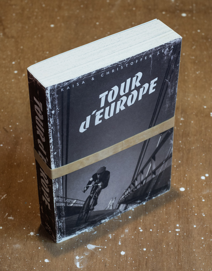
First of all we started by envisioning a book as clunky and impractical as a bike ride spanning four countries and thirty days. What we landed on was a pocket book too big for any pocket we’ve ever known. This seemed only natural – an arduous journey requires a format of the same kind.
The book should also look battered and bruised, much like the two cyclists who did the journey in the first place. A book you would throw into a bag without remorse and read it whenever you had some time off.
(Fun story: At a comic book convention we attended a lady came to buy the book from us and exclaimed in surprise: ”Oh! It is supposed to look like this? I thought the library copy I read had just been terribly mistreated!”)
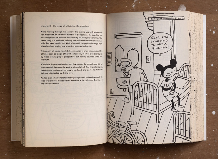
The contents of the book consist of a graphic novel drawn by Kaisa, divided into eighteen chapters, all of them beginning with a reflection over our human traverse on this earth.
The book speaks of two journeys, the external one, i.e. cycling from one country to the next, but to an equal degree of the internal journey of an adventurer. It deals with the meditative aspects of road cycling. (Trust us, this will be important later on.)
Now that we have the background information sorted, we can dive into the topic you came to read about: typography!
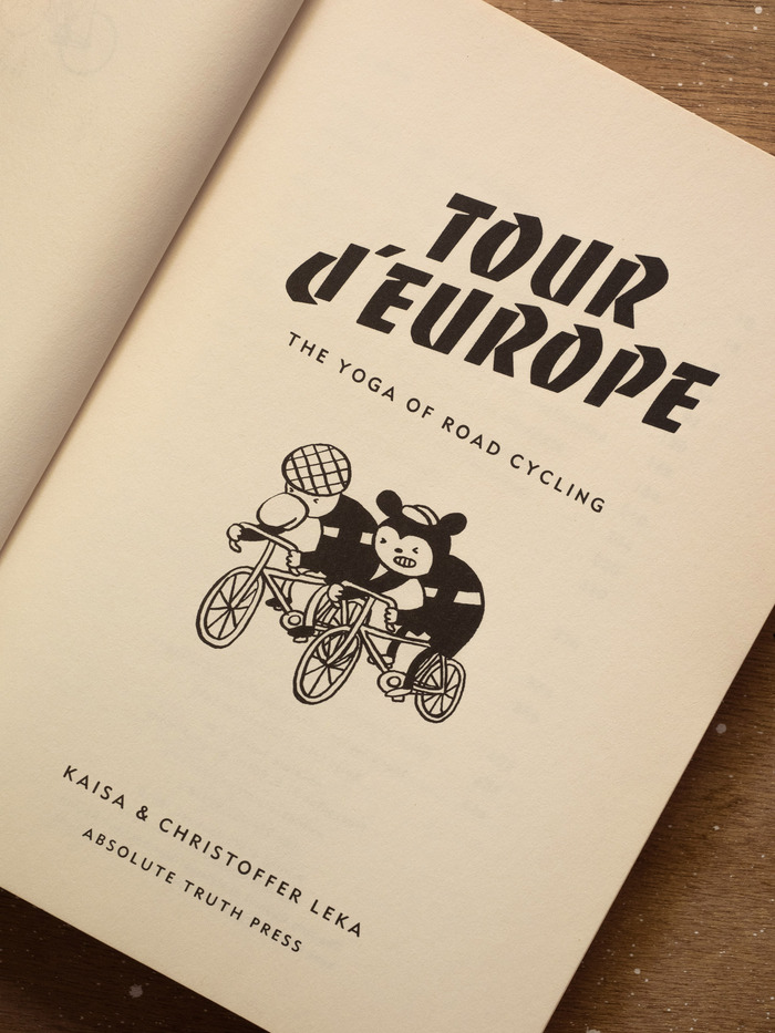
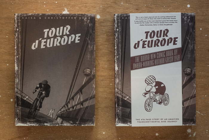
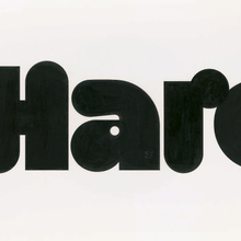
As the most astute of you have already figured out, the headline is set in Banco by Roger Excoffon. For us it was the obvious choice, as it is French, and because it has a distinct ’50s feel to it. The style we we’re going for with the book’s visuals was a nostalgic one, hinting back to a time when traveling still felt like traveling.
For the secondary type we knew we wanted a sans serif, preferably a geometric one. But this time our old friend Futura felt out of place. Too cold, too logical. There was little logic to our venture anyway. So something else, something a bit quirkier, an underdog of sorts.
Perusing our collection of type specimens and books on typography, we found the perfect contender: WAD’s Metro No. 2!
In a book Dwiggins wrote in 1928, he complained about the lack of good gothic capitals. Harry L. Gage at Mergenthaler read the piece and promptly commissioned Dwiggins to create a sans serif of his own. Thus Metro was born, and while it might not have outshone Futura, it was still the perfect fit for us – a bit idiosyncratic and not super popular, just like the two of us!
To make the type a bit softer with a slightly less crisp feel to it we aged all text through a both intricate and secret process. (Just in case you’re thinking that this looks nothing like the Metro you knew.)
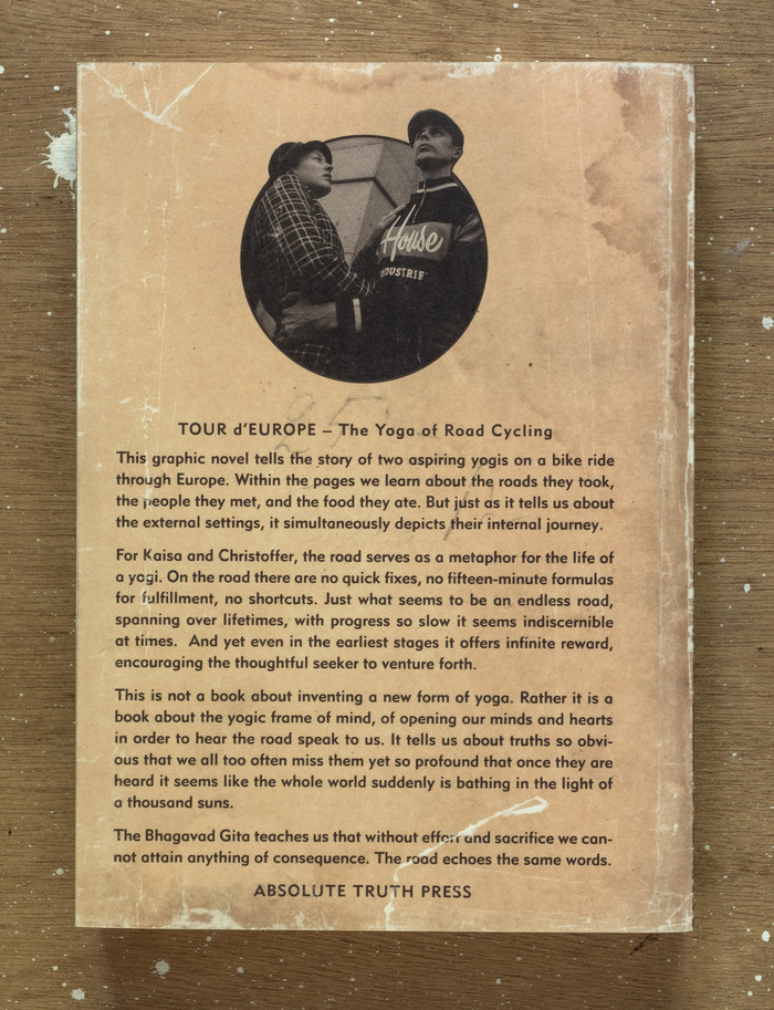
You will also see that we made two different covers. Or at least an additional dust jacket of sorts.
This was due to Kaisa being convinced that no one in their right mind would buy a comic book that had a photo on the cover.
So we reached a compromise – on half of the print run there would be a dust jacket with some promotional text to go along with the cartoon representation of Christoffer cycling.
We’ll leave it to you to debate which one works better!
The important thing here is that here we encounter yet another typeface – this time we used Morris Fuller Benton’s Empire, which adds to the classy feel of the project. For us it is all about class! Empire felt like the perfect companion to Banco and Metro, even when such a pairing might not be text book.
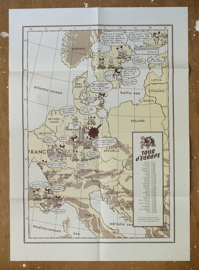
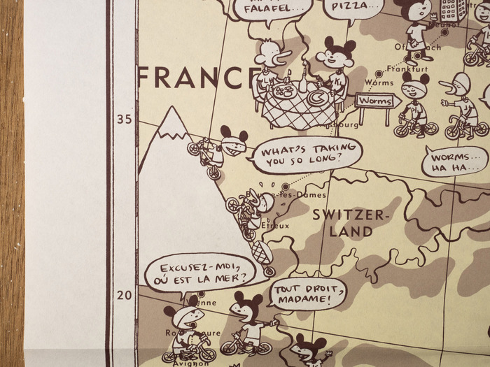
And speaking of books, what adventure book would be worth its salt, should it not include a map?
That is why we too were compelled to add a map depicting our adventure through Europe in the back of the book. As true to the modernist ethos we stuck with the same tried and tested typefaces as in the book itself – Mostly Metro with just a smidge of Banco thrown in for good measure.
And that’s it, the story of one of our more beloved books to date. But fear not, we will return to this very topic in a second post, as there is more to this project than a simple book.
In the meantime if you desire to learn more about our projects you can turn to our website.
Formats
- Books (5439)
- Infographics/Maps (480)
Topics
- Travel (684)
Designers/Agencies
- Christoffer Leka (11)
- Kaisa Leka (10)
Tagged with
- self-initiated projects (342)
- Absolute Truth Press (4)
- bicycling (82)
- travel (115)
- diaries (30)
- Europe (32)
- book covers (4807)
- banderoles (51)
- book interiors (2892)
- faux vintage (125)
- comics (93)
- graphic novels (21)
- italic/script on an angle (318)
- title pages (838)
- maps (347)
- paperbacks/softcovers (1495)
- self-published (244)
- modified typeface (1470)
- back covers (1673)
- synopsis (12)
- chapter openings (679)
- author as designer (132)
- lettering (540)
- speech balloons (146)
- repurposed glyphs (193)
- rotated/upside-down glyphs (202)
- book spines (1230)
- rubber/elastic bands (13)
















1 Comment on “Tour d’Europe by Christoffer and Kaisa Leka”
Since Banco is an all-caps typeface, I’m pretty sure the lowercase d here is an upside-down P. The apostrophe also looks a little weird to me.