
Sorry! board game (1972–)
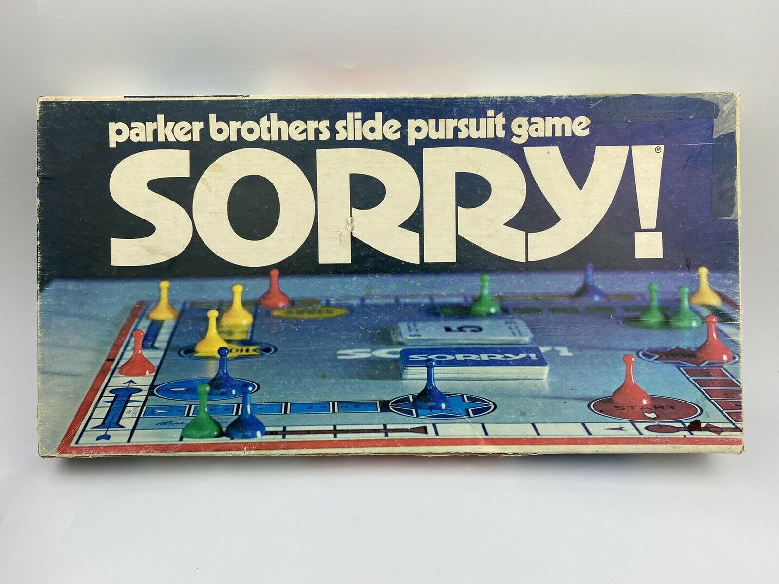
1972 edition with Kabel Black as secondary typeface.
Sorry! is a popular board game in which players try to travel around the board with their pieces (called pawns) faster than any other player. The game was first published in 1929 in England by W.H. Storey & Company and in later years was introduced to America by Parker Brothers. Today it is wholly owned and distributed by Hasbro.
Since 1972, its logo typeface is Advertisers Gothic. It’s bold and brash, like the city it comes from, Chicago. Advertisers Gothic was designed by the accomplished German-American matrix engraver, Robert Wiebking, for the Western Type Foundry in 1917.
Find more information about Sorry! on Board Game Geek.

1972 edition.


2020 edition. The secondary typeface is Avenir.

2021 edition.
![The Simpsons edition, 2007. Secondary typefaces include [or rather the digitization , see comments] and .](https://fiu-original.b-cdn.net/fontsinuse.com/use-images/137/137791/137791.jpeg?filename=s-l1600.jpg)
The Simpsons edition, 2007. Secondary typefaces include Filmotype Maxwell [or rather the digitization Will Robinson, see comments] and Futura Extra Bold Condensed.

Madagascar edition, 2005. The film logo is probably custom, “Edition” is in Estro.


")


")


")


3 Comments on “Sorry! board game (1972–)”
Will Robinson seems to be used here instead of Maxwell; the former is likely a freebie interpretation of the latter, which wouldn’t receive an official digitization until 2019. Here’s its download link: www.dafont.com/will-robinso…
Agreed, and changed. Thanks, Bryson!
Where can I get a new deck of cards?