
Popeye magazine No. 880, “Summer Reading 2020”, August 2020
Contributed by Frode Helland (Monokrom Skriftforlag) on Feb 8th, 2021. Artwork published in
circa August 2020
.
Source: omoionline.com License: All Rights Reserved.
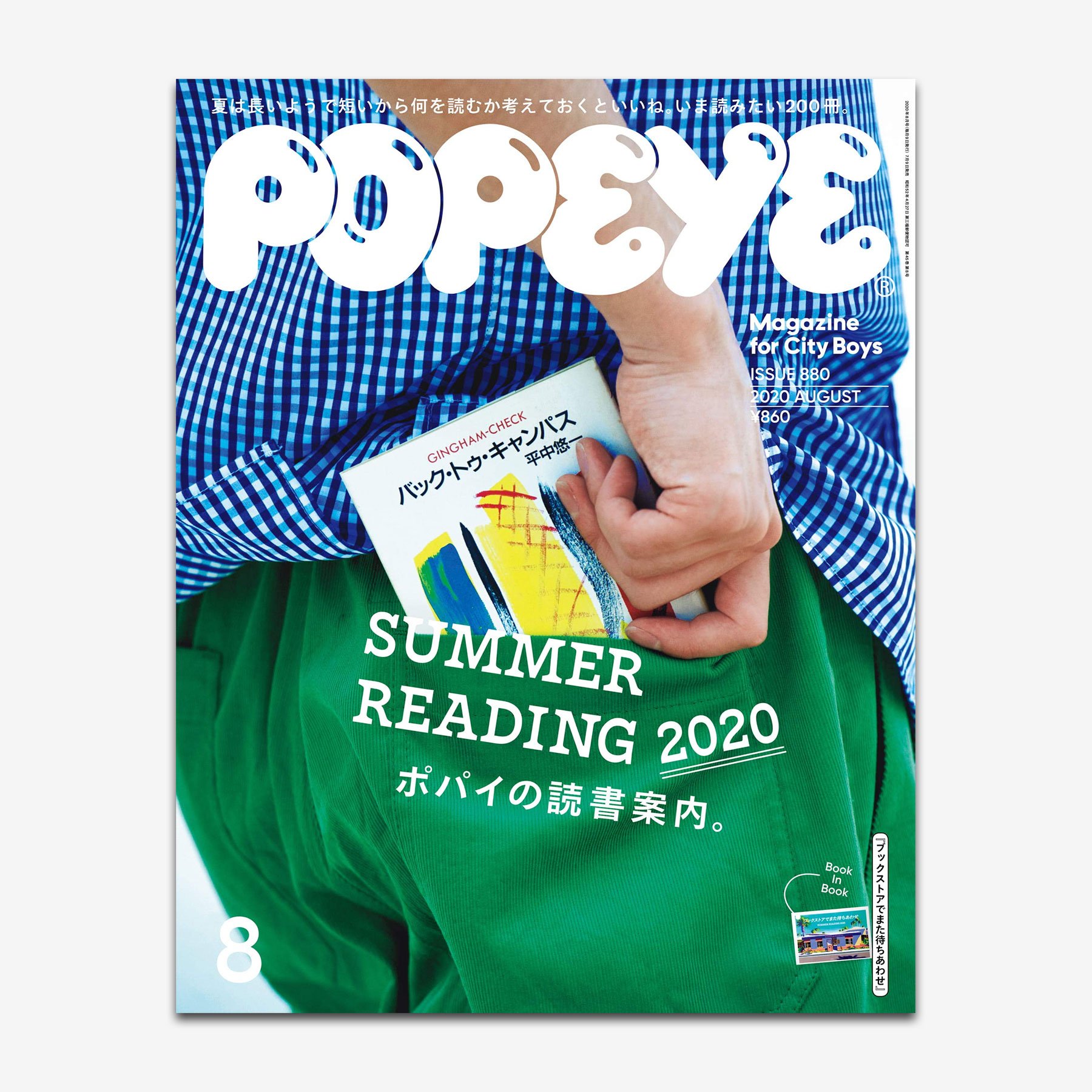
The talented Tokyo-based design studio Shiroi Rittai is responsible for the art direction of the Japanese long-running men’s fashion magazine Popeye. The “Summer Reading 2020” issue (No. 880) features Nina Stössinger’s Nordvest in capital letters, a setting for which Nina intentionally omitted the usual automatic tracking.
The Popeye masthead, named after the cartoon character, appears to be custom lettering – a refined take on the original logo from 1976. It has some similarities with Frankfurter Highlight, but with the highlights located north-east. The Japanese fonts as well as the geometric sans serif are yet unidentified [edit: see comments].

Source: clementthoby.com License: All Rights Reserved.

Source: twitter.com License: All Rights Reserved.
Source: clementthoby.com License: All Rights Reserved.
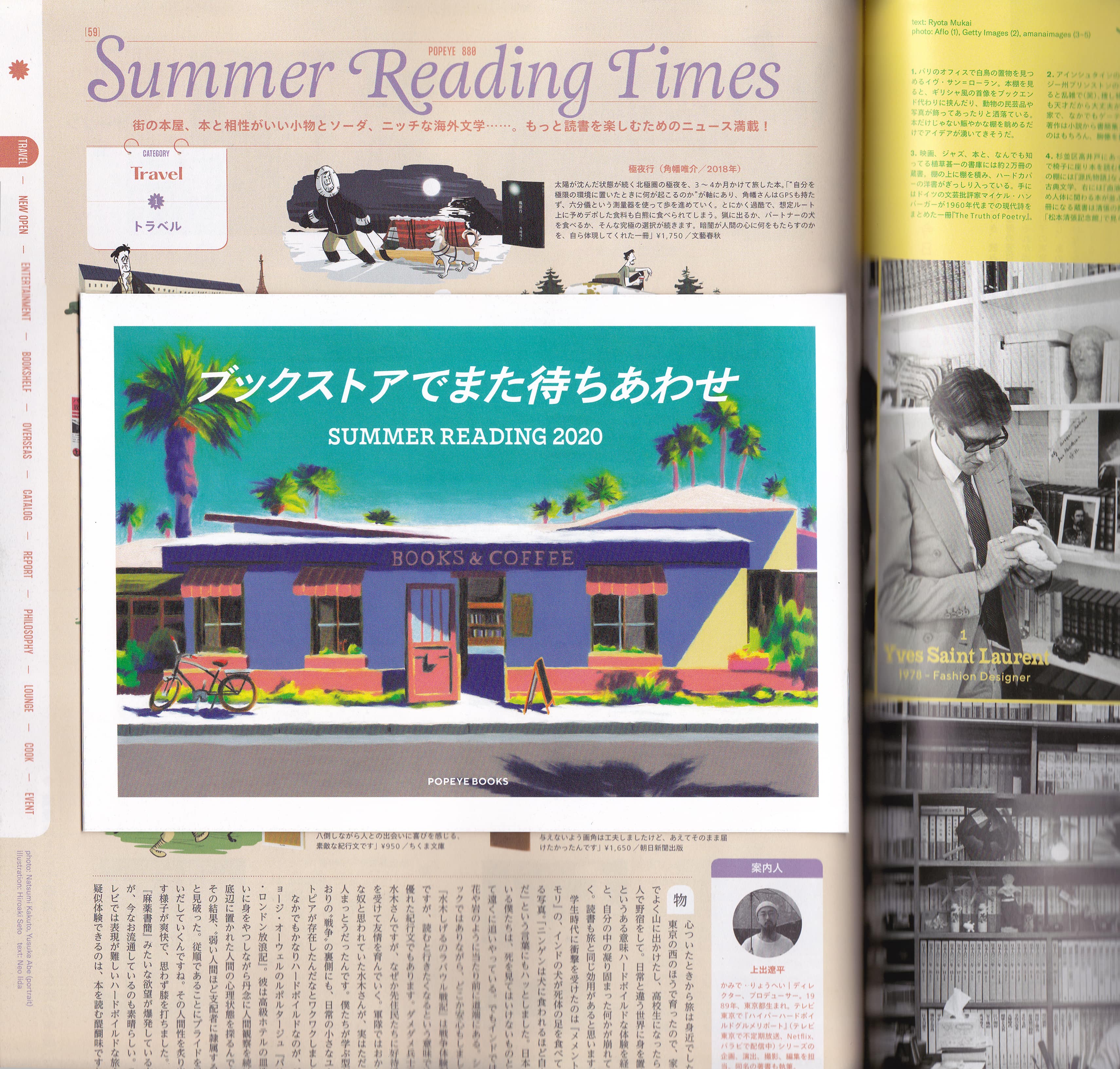
“Summer Reading Times” uses Adriane Swash.

Source: magazineworld.jp License: All Rights Reserved.

Source: magazineworld.jp License: All Rights Reserved.


1 Comment on “Popeye magazine No. 880, “Summer Reading 2020”, August 2020”
Our esteemed colleague Akira Yoshino of Typecache kindly provided IDs of the missing typefaces.
どうもありがとう、アキラ!