
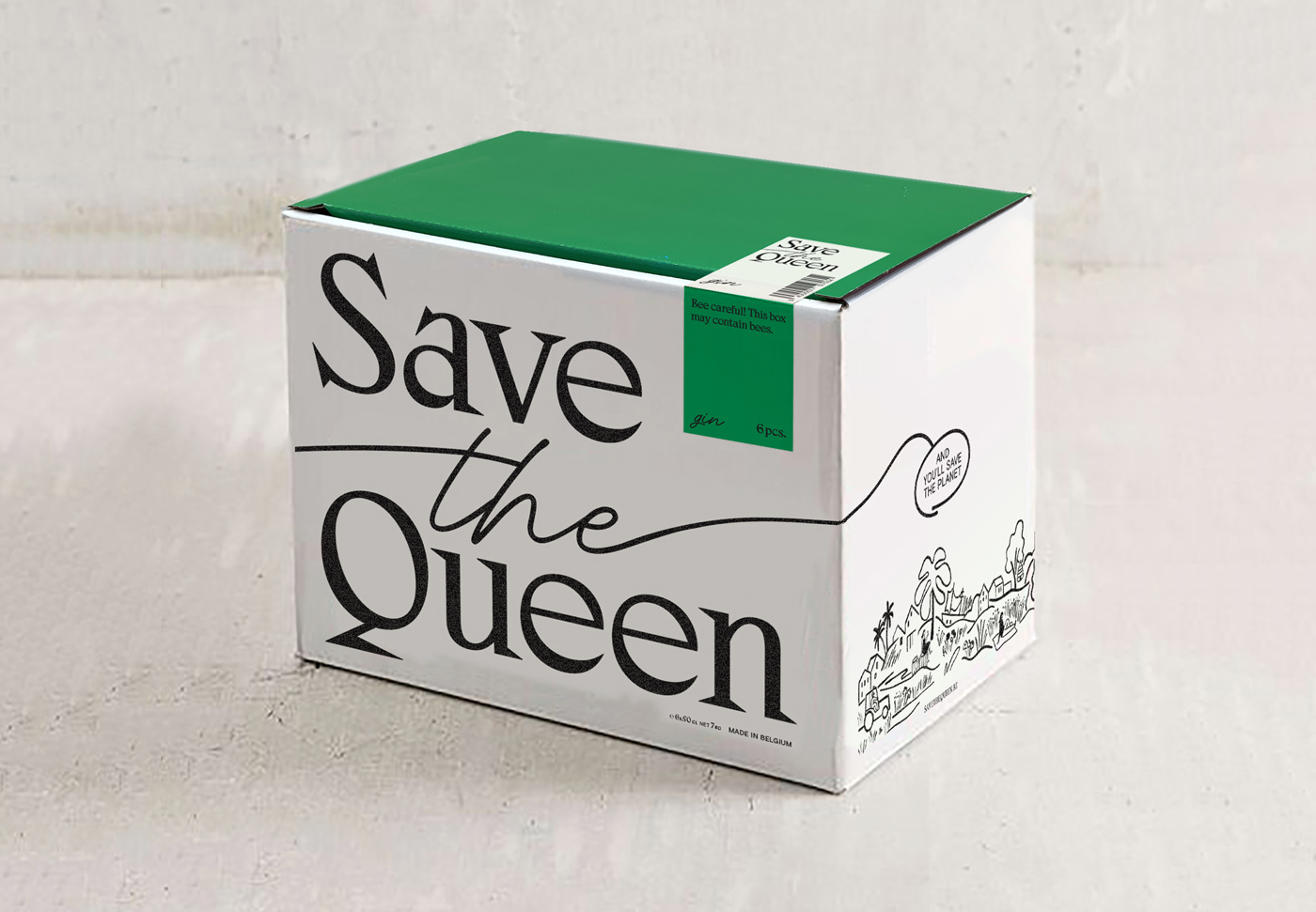
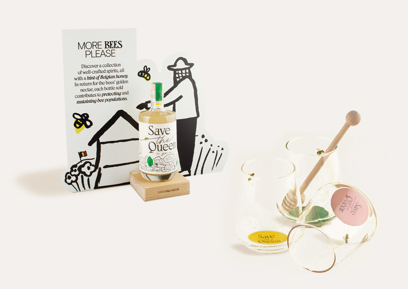
Save the Queen

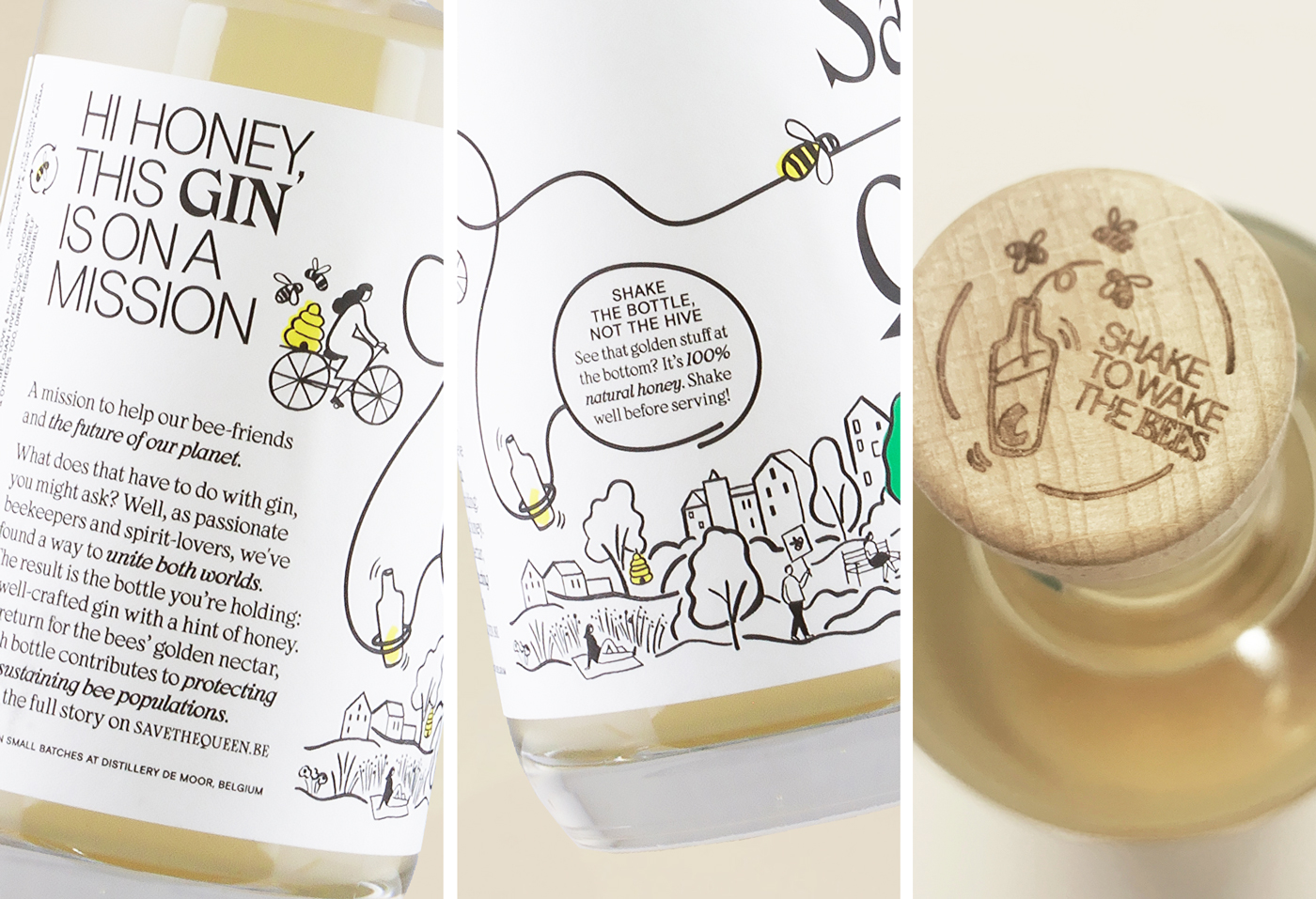
Save the Queen is a premium brand of honey-hinted spirits on a mission. Each bottle sold contributes to protecting and sustaining bee populations, together with local beekeepers.
The identity was created by Belgian design studio Superset, who playfully combined Zangezi with Basis Grotesque Pro and Adventures Unlimited Script, along with illustrations by London based illustrator Charlotte Trounce.
Here’s what the designers say about the rebranding:
“Save The Queen has always been about working together with bees, for bees. We wanted to visualise the collaboration between man & bee, spirit & honey, distillery & hive, by representing both voices in the new design.”
The script follows the movements of a bee in flight, while Zangezi and Basis Grotesque serve as a solid and distinctive foundation on which the brand is built.
Though expressive typefaces like Zangezi usually work best on their own, this is a beautiful example where illustrations and two additional typefaces – one of which is also quite expressive – work very well together. The secret is in the well-balanced relationship between the various elements: the weight of Basis Grotesque and the fluidity of Adventures Unlimited Script correlate well with the thinnest strokes of Zangezi. Similarly, the contrast in the strokes of the illustrations correlates with the strokes of the typefaces.


")


")


")


