
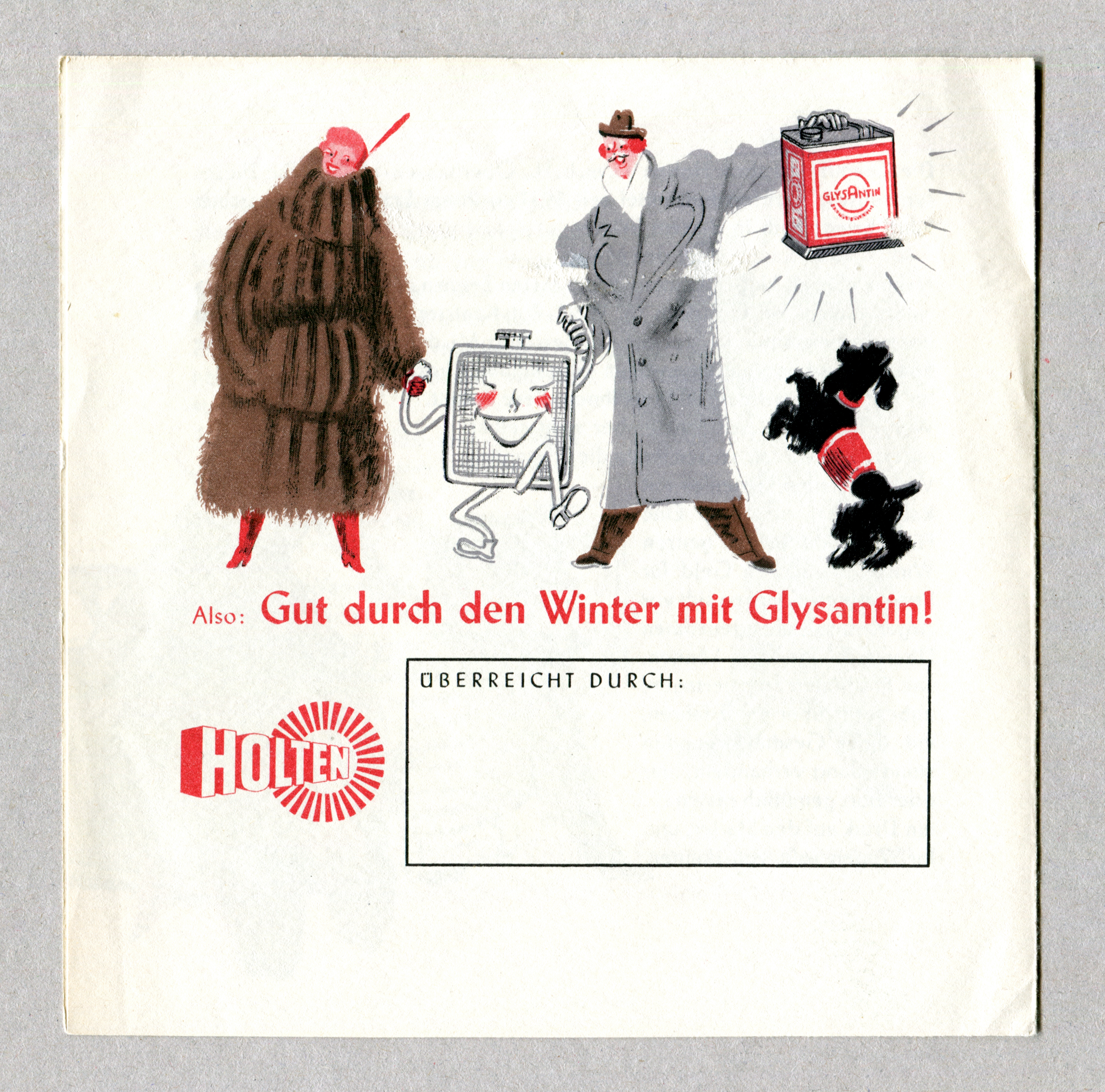
“Gut durch den Winter mit Glysantin!”

“Get through the winter well …”
Two weights of Stahl (Gebr. Klingspor, 1939) and one initial from Legende (Bauer, 1937) in use for a leaflet advertising an antifreeze agent.
Stahl, or Steel, as it was named for markets abroad, was made by Hans Kühne. Just like Warren Chappell’s Lydian or Walter F. Kemper’s Colonia, it’s the work of a designer who studied unter Koch at the Technische Lehranstalten Offenbach. As Frank Grießhammer points out,
Hans Kühne was the successor of Rudolf Koch as the teacher for “Schrift” in Offenbach, and unfortunately he also was a big douchebag. Kühne denounced Koch after he died (for his jewish friends), and did everything to be a good Nazi (and keep his job).
Stahl is a continuation of the “uncial” (i.e. roman) capitals drawn by Rudolf Koch for the Offenbach typeface.
Glysantin is a brand name for a cooling water additive that can be used in internal combustion engines. It was the first antifreeze on the market. Developed in 1926 by the chemist Jordan, it was patented in 1929 and launched in 1931. This leaflet is probably from the 1950s, when Glysantin was produced by the Chemische Fabrik Holten GmbH in Oberhausen. This company was founded in the 1930s by the Ludwigshafen branch of IG Farben (previously and subsequently known as BASF). The Glysantin brand is still in use today.

The initial L is from Ernst Schneidler’s Legende. Also emulating a broad-nib pen, it pairs well with Stahl.
Note the use of ch ligatures. Together with ck ligatures, this habit was carried over from blackletter typography and still enjoyed widespread use in Germany in the 20th century.


