Karl Arnold invoices, 1920s
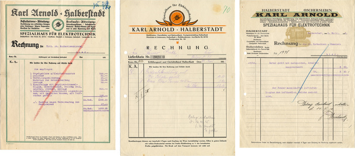
How to follow up on a double feature? Well, with a triple feature, of course! This week’s episode is about three invoices by Karl Arnold, a specialized dealer and service provider for electrics in Halberstadt. The first one is undated, but the use of Deutsche Zierschrift suggests a date after 1921, and the unusual abbreviation for the currency (“Sa.Gmk.” for Summa Goldmark?) might indicate a date before the end of the hyperinflation in 1924. The second one was issued in September 1925, and the third one in November 1926. In any case, the invoices were all used within a few years, but are highly diverse in design. The series is another evidence that maintaining a consistent visual identity was not really a thing yet. Apart from the name, the only element that is repeated and hence has branding qualities is the circled ‘KA’ monogram with lightning bolts, and even that was dropped in the third version.
A new letterhead became necessary in 1926 because the phone number system had been extended from three to four digits. Also, the company now had a branch in Oschersleben which needed to be acknowledged. The reasons for the previous change are not so clear. Was blackletter no longer considered in vogue? Or were the printed invoices simply used up and Karl Arnold now longed for something fresh? The first and the second invoice were both printed by C. Doelle & Sohn and exclusively use typefaces by the Gebr. Klingspor foundry. The third one was printed by Max Arnold. It is inferior in design quality, and exhibits some characteristics that actually make it appear older — a more eclectic mix of typefaces incl. some that date from the 19th century, less clear alignments, and a goofy engraving of an electric motor. One year after the publication of Tschichold’s Elementare Typographie, this was definitely a step back.
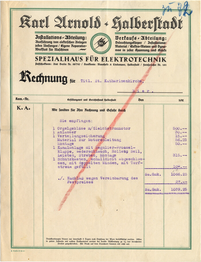
The first invoice is a feast for fans of Rudolf Koch’s work. In addition to the magnificient Deutsche Zierschrift (1921), there is Maximilian (1917), complete with a swash initial (in “Rechnung”) and the accompanying set of open roman caps also known as Maximilian-Antiqua (for “Spezialhaus für Elektrotechnik”). The fine print is in Walter Tiemann’s Tiemann-Fraktur (1914). The invoice is for equipping the pipe organ at the local St. Katharinen church with bellows powered by an electric motor. (John Cage’s organ piece As Slow As Possible is currently being performed in another church in Halberstadt.)
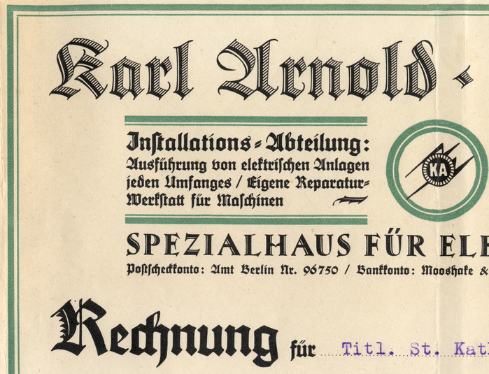
Detail: The last line in the block between the green borders does not reach the full width. This has been balanced by filling the gap with a floral ornament from Maximilian’s glyph set.
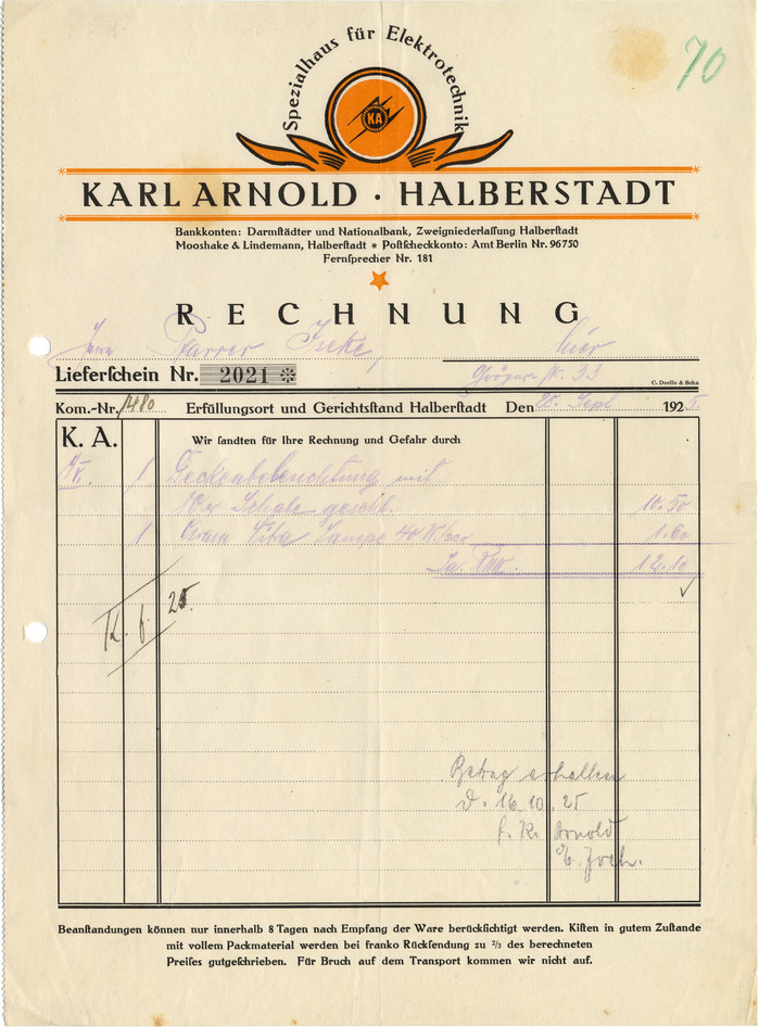
The invoice from 1925 arguably is the most modern one. Its typography is limited to a single typeface, Behrens-Antiqua (1907) by Peter Behrens. Color is used more selectively. The frame and the list of services and products were dropped in favor of ample whitespace.
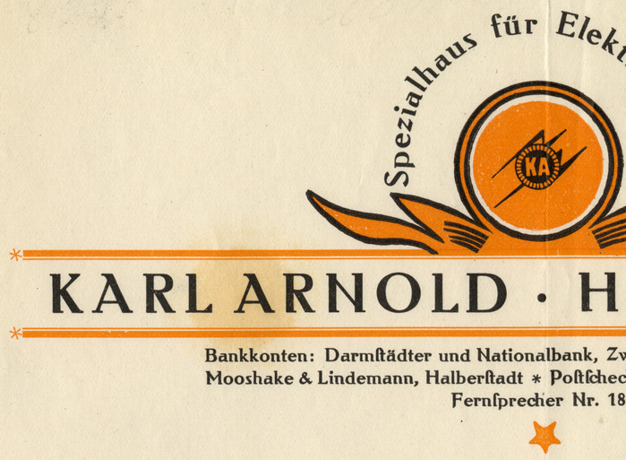
Detail: Metal type set on a curve! That’s quite a challenge. Using two forms of ‘s’ can be helpful: The bank’s name doesn’t have a long ‘s’ (ſ). It hence is not Moo·shake, but Moos·hake, .
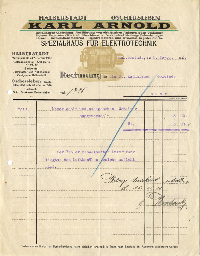
The bold wide caps with triangular serifs are from Latin Wide (1883). The Victorian caps used for “Spezialhaus für Elektrotechnik” might be from Graziosa (around 1900?) as cast by J. John Söhne. The small sans serif bits are probably in Reform-Grotesk (1904). The footer (and only the footer) is set with long ‘s’ (“Berückſichtigung”, “dieſelben”). The secret star in this wild mix is Michel-Antiqua (1919), a horizontally hatched roman by Karl Michel. Unfortunately, it has been used for too much text, in too small sizes. In addition, the printing is so poor that this little gem can’t really shine.
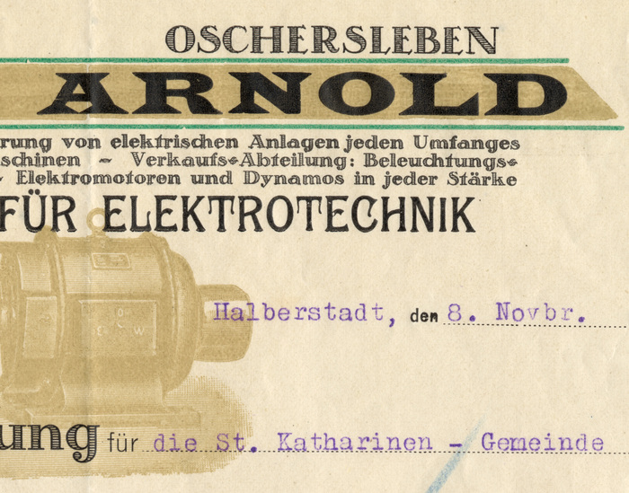
Detail: Karl Michel’s Schraffierte Antiqua was cast in sizes as small as 8pt. That doesn’t mean it is a good idea to use decorated typefaces in such small sizes.
Non-typographic side note: Two of the invoices are addressed to the St. Katharinen church, one to a Pfarrer Iseke. I was curious to know whether Iseke belonged to the same parish, and stumbled upon another terrible episode from the Nazi period. Franz Iseke (*1872) indeed was priest at St. Katharinen from 1917 on. During National Socialism, he didn’t knuckle down, continued to preach Christian values and tried to prevent teenagers from being indoctrinated by the Nazi ideology. The regime took revenge and harassed him repeatedly with house searches and interrogations. In August 1937, Iseke was arrested by the Gestapo and expelled from Halberstadt, which shook him to the core, leading to his premature death in January 1938. [Orlob, Dt. Martyrologium] When it’s about Germany in the second quarter of the 20th century, the horror of discrimination, persecution and war is rarely more than a web search away, even when the subject is type on letterheads. It’s a chilling reminder what totalitarianism means.
Typefaces
Formats
- Branding/Identity (6685)
- Ephemera (1036)
Topics
- Product (1594)
- Services (1228)
- Technology (1218)
Designers/Agencies
Tagged with
- invoices (54)
- letterheads (346)
- 1920s (96)
- redesign (530)
- electronics (25)
- German (language) (1959)
- green (652)
- orange (401)
- blackletter (255)
- type series (700)
- type on a curve (869)
- uncertain typeface ID (183)
- metal type (129)
- job work (204)
- Weimar Republic (89)
Artwork location
- Germany (3274)
- Halberstadt (2)


